Sumpry®
Typographic Identity for a Tokyo-based Fashion Brand
Services Provided
- Branding
- Copywriting
- Photo Production
- Packaging
- Strategy
Specs
Services Provided
- Branding
- Copywriting
- Photo Production
- Packaging
- Strategy
Specs
1
Objective
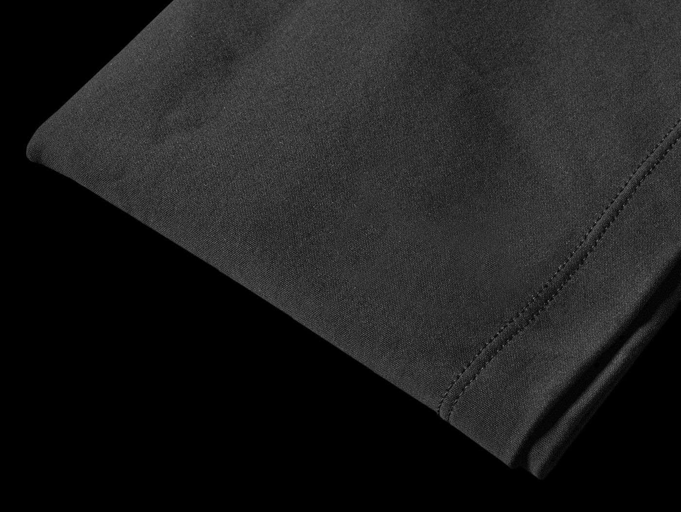
Atsuki, an architect from Tokyo, approached us to help him create a corporate identity for his fashion brand. His idea was to create nothing less than an ultimate t-shirt, or rather plural - t-shirts. He applied the reasoning behind an architectural program to design probably the most essential (bar underwear) item of our everyday fashion inventory. That is he wanted to create a series of t-shirts tailored (literally) for the function they perform and the occasion they are used in.
2
Approach
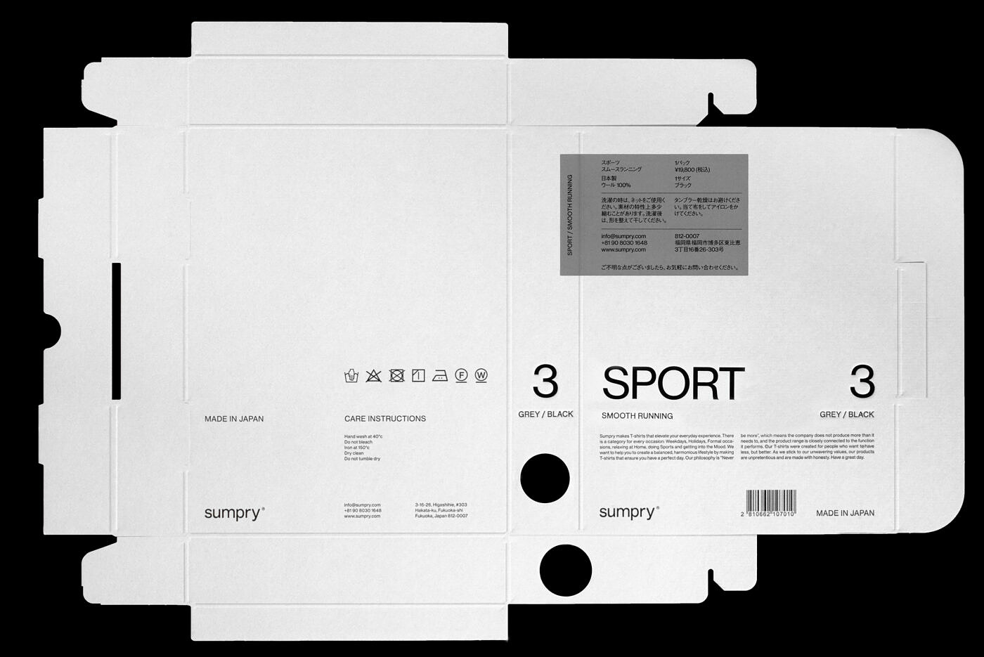
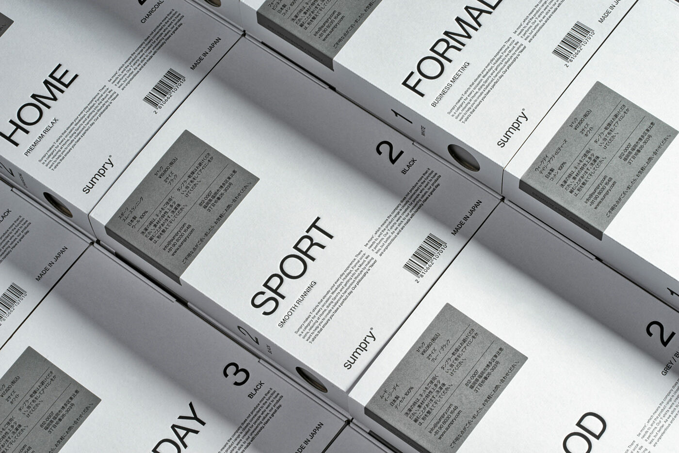
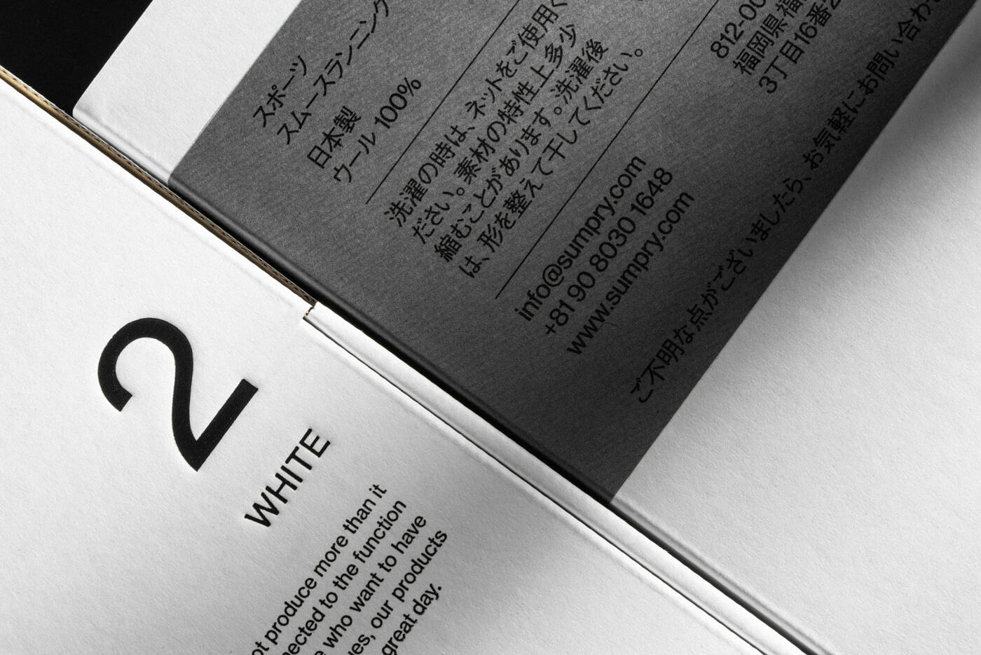
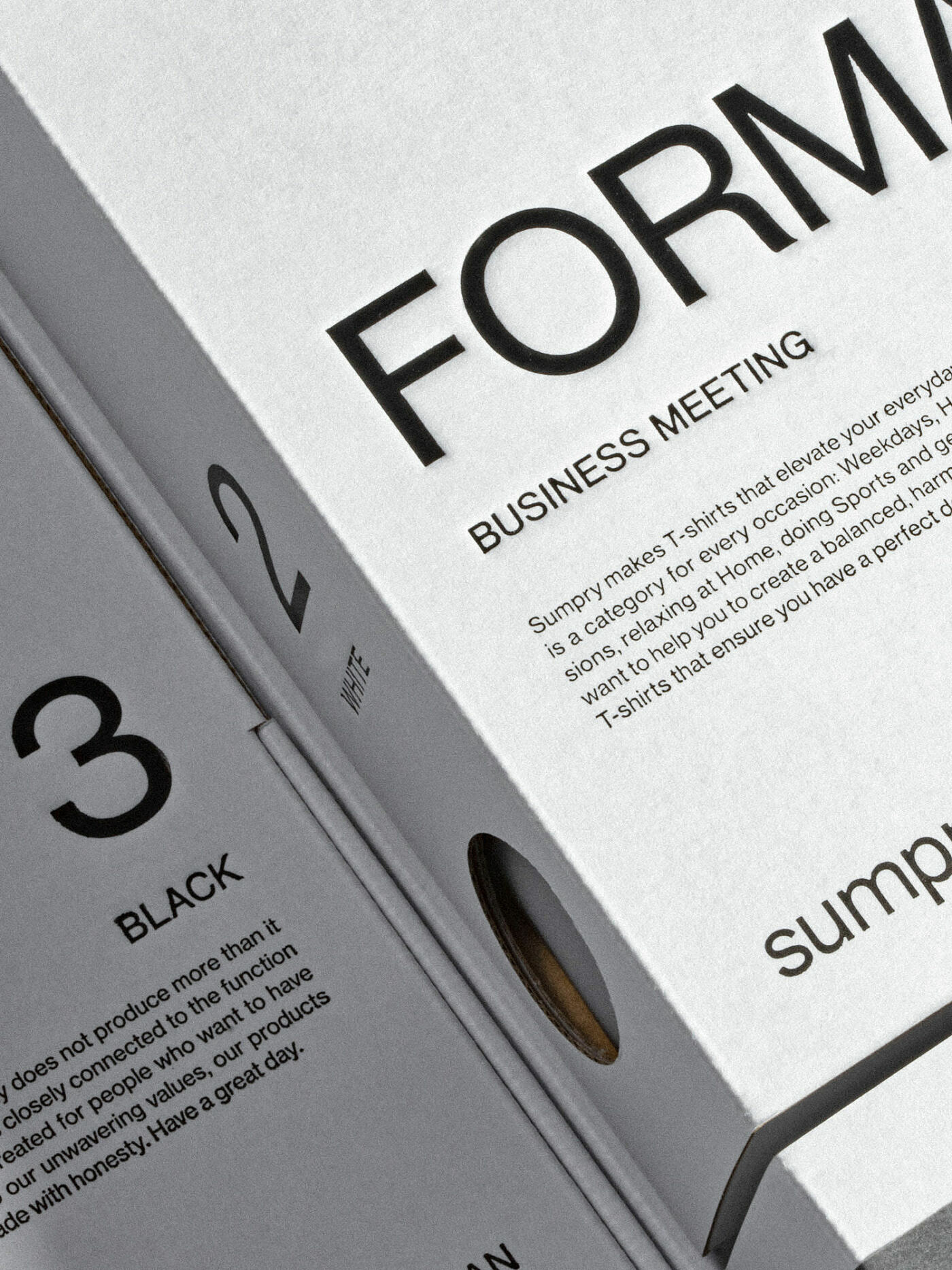
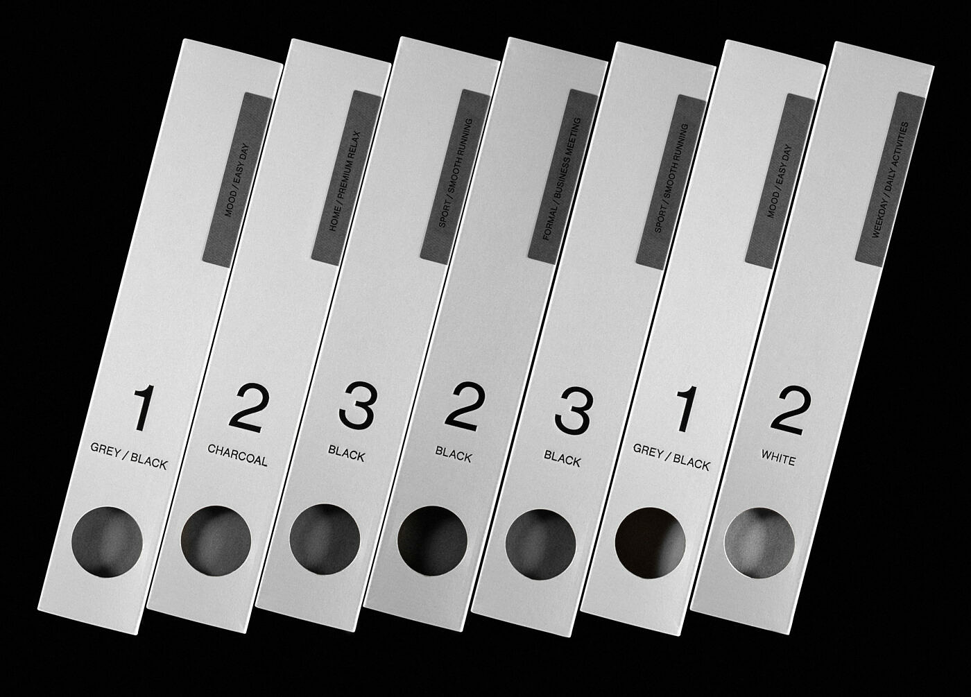
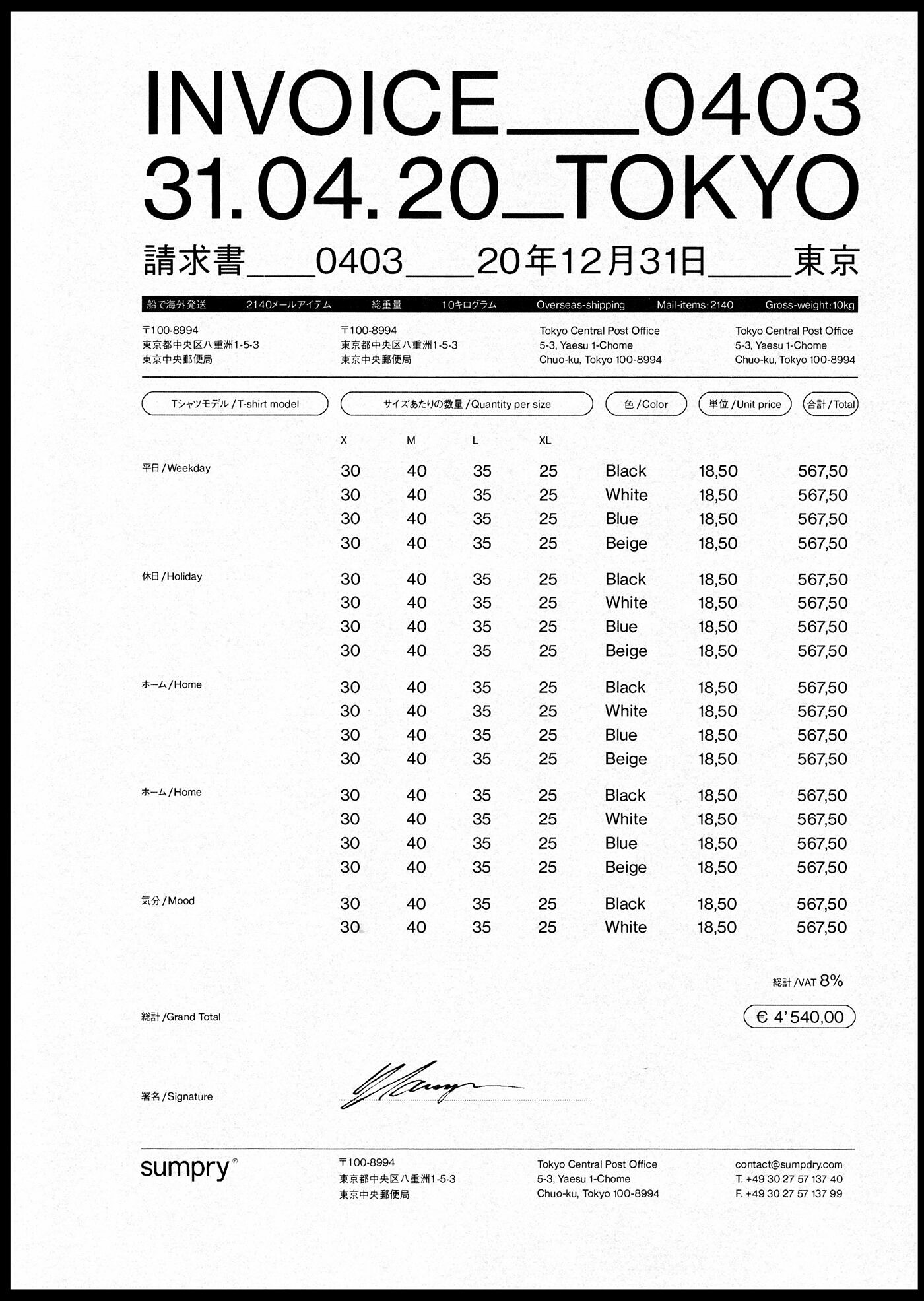
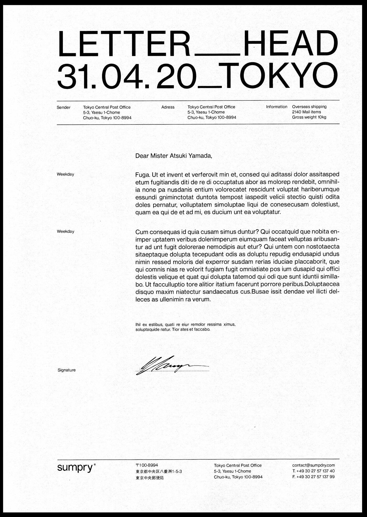
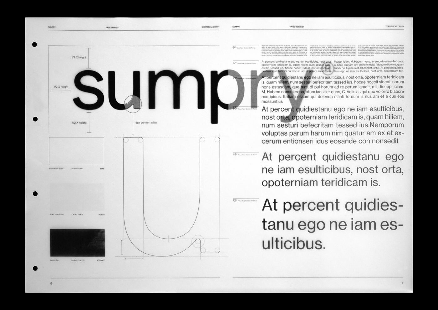
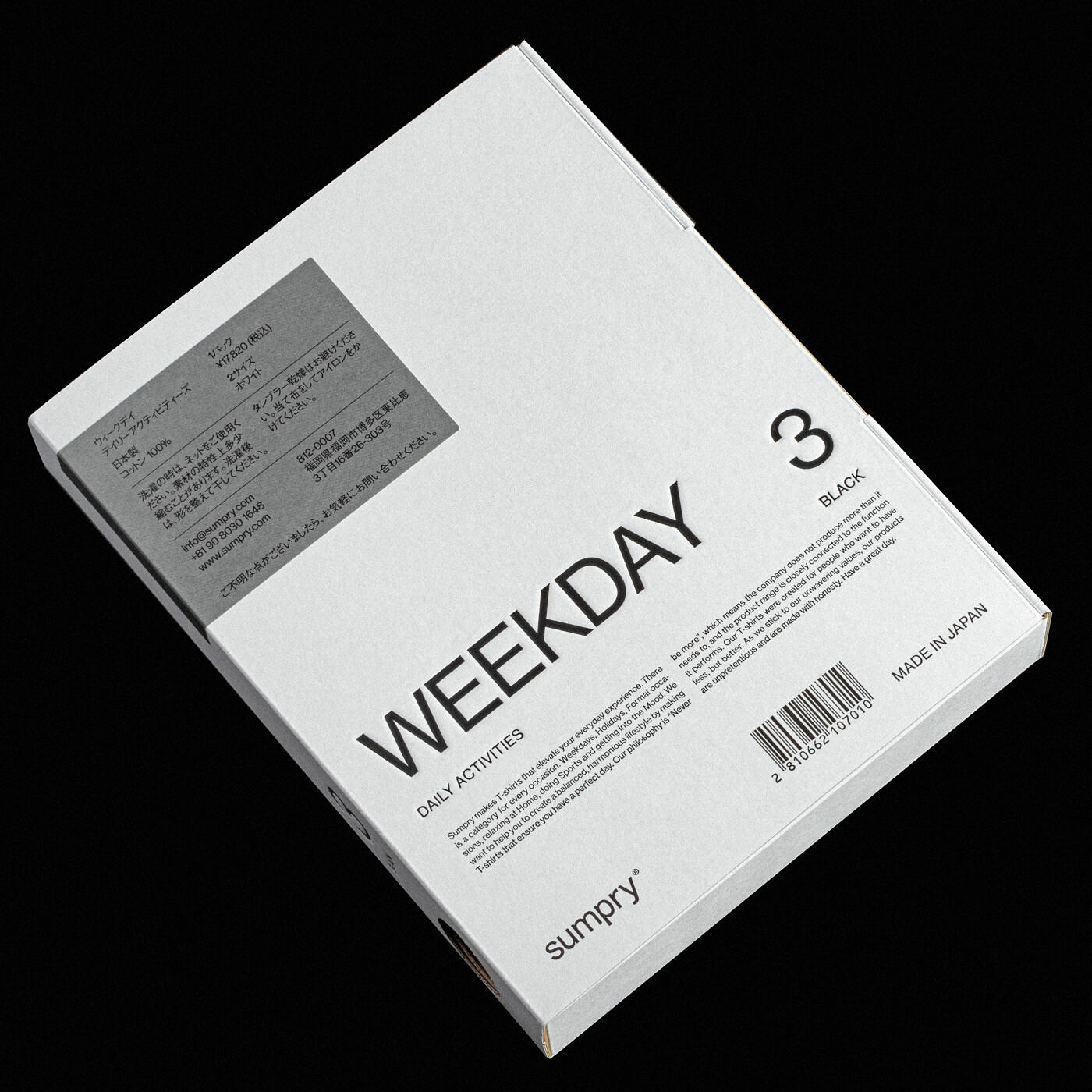
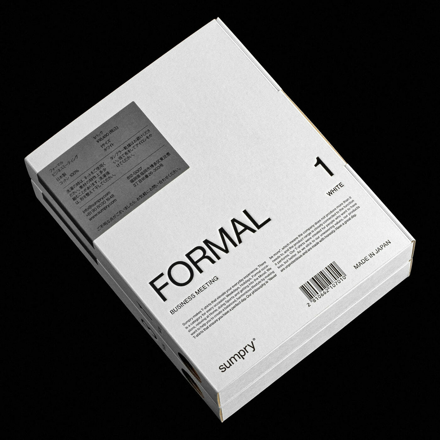
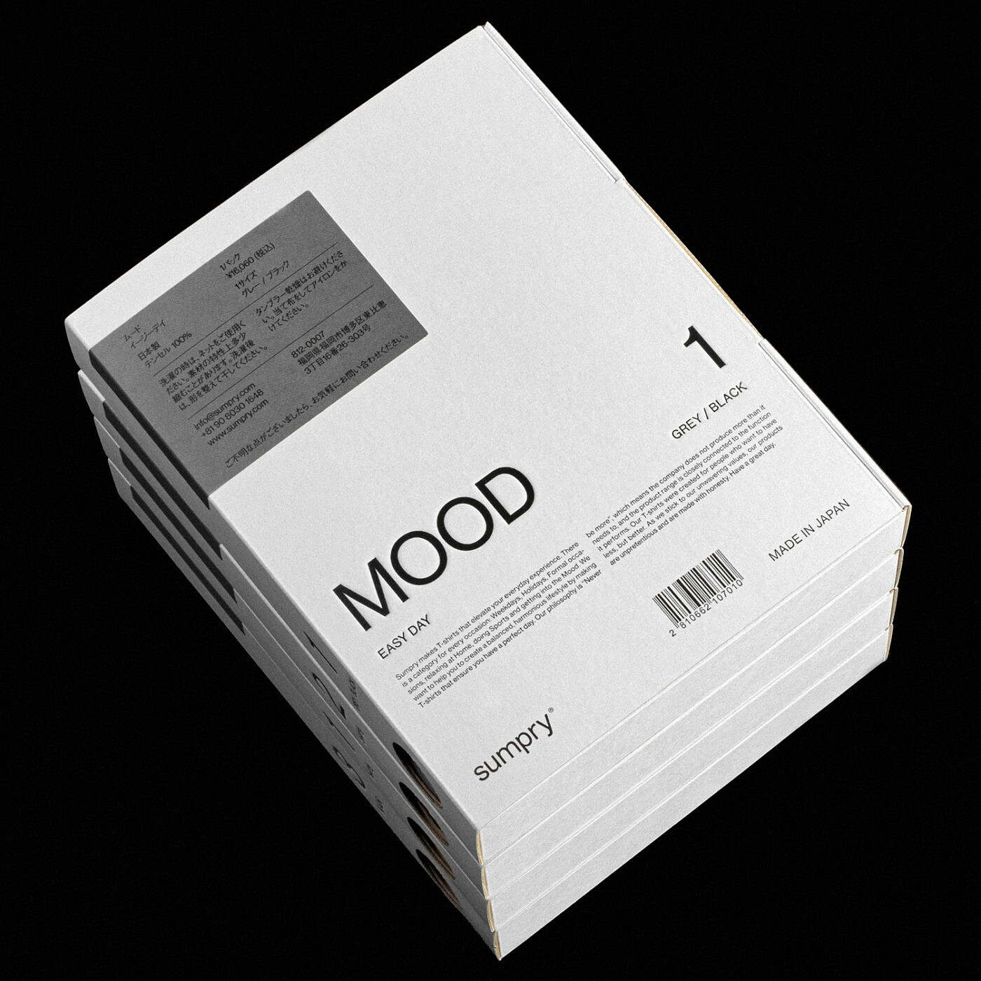
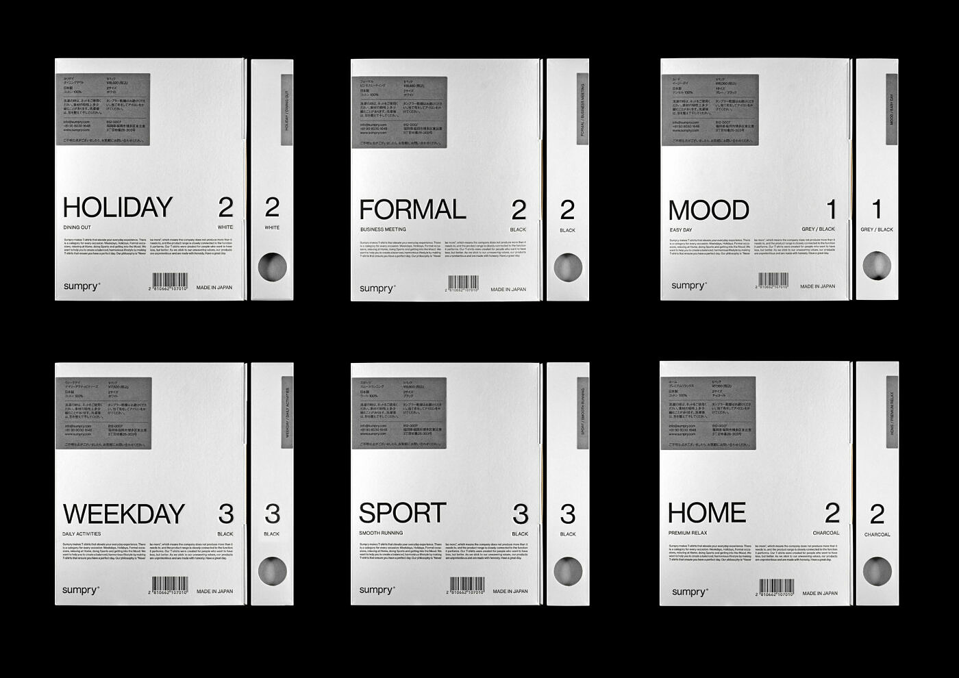
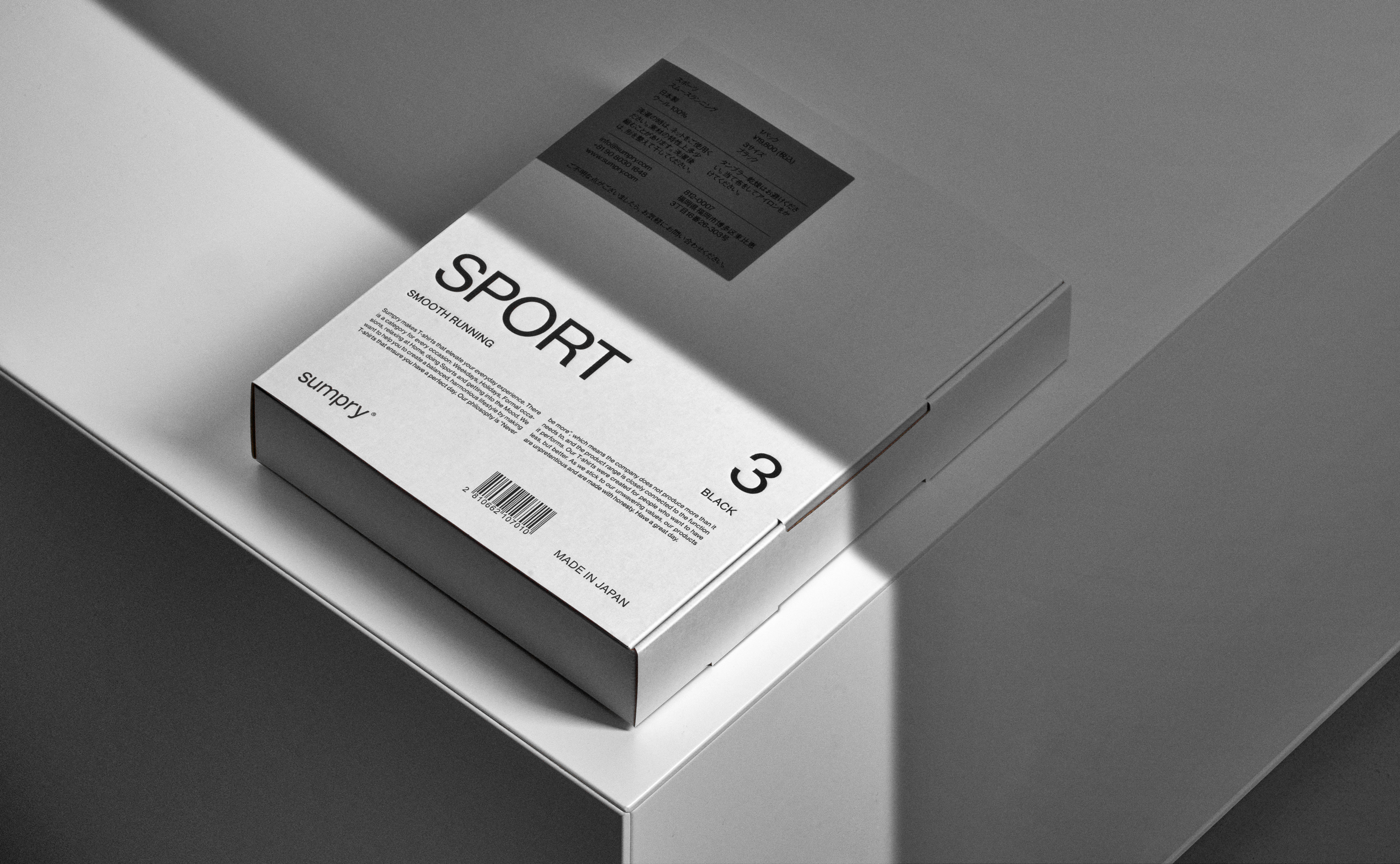
Going as far as designing textiles and yarns, Atsuki took the task at hand very seriously. Which meant we couldn't possibly slack off as well. We opted for a purely typographic identity revolving around the packaging. There were 6 categories: Weekday, Formal, Home, Mood, Sport and Holiday. Each would come in a range of colours. To organise them in a clear, concise, way we created a typographic system that would both ease the selection and look great.
3
Solution
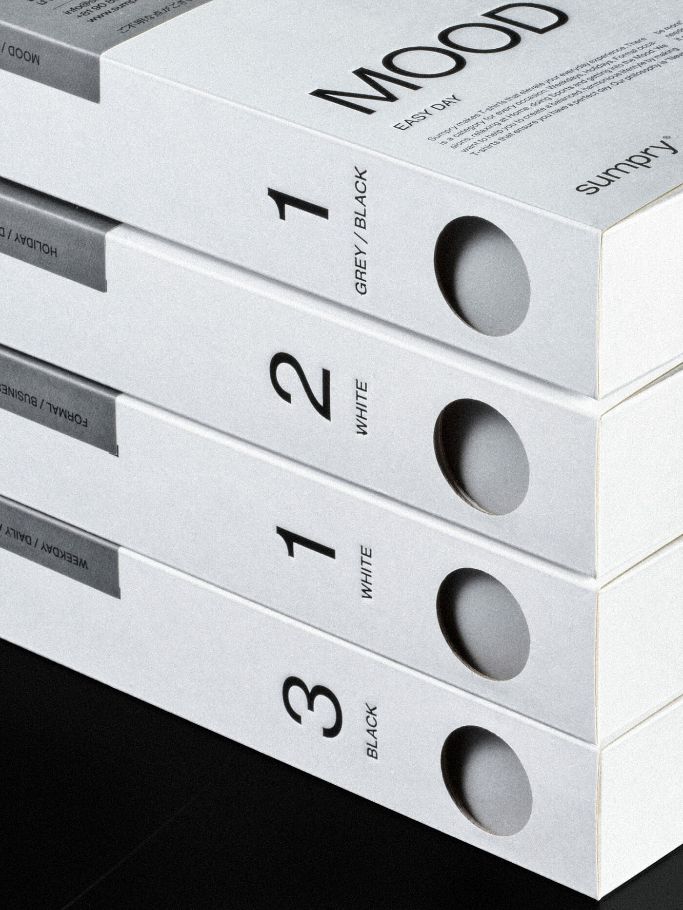
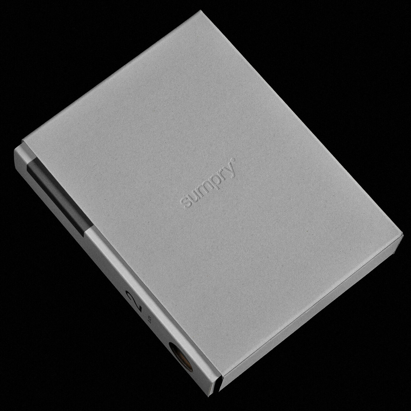
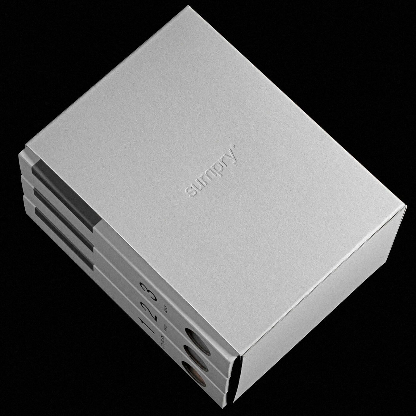
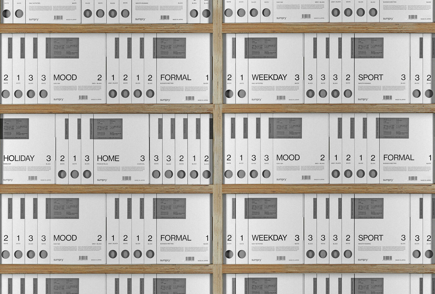
The plan was to have a dedicated store in Tokyo as well as an online shop. We wanted the single t-shirt packaging to become a well recognisable, timeless object that would serve both as a single unit and when multiplied, creating a strong visual presence with regular patterns of circles and rectangles. An identity so mathematical it almost becomes poetic. We limited ourselves in the means of expression just (hopefully) arrived at something expressive.
