YOC 24
A better Advertising
Experience for Everyone
Services Provided
- Branding
- Motion Graphics
- Web Design
- UX/UI
- Development
Specs
Services Provided
- Branding
- Motion Graphics
- Web Design
- UX/UI
- Development
Specs
1
Objective
YOC is a pioneer in developing cutting-edge technology through its high-impact advertising products and solutions, as well as the innovative VIS.X® platform. This platform is designed to foster a seamless and meaningful connection between premium publishers, advertisers, and users within the digital landscape. With a focus on creating immersive experiences, YOC continues to push the boundaries of digital advertising.
As part of their recent brand refresh, we were invited to take on the challenge of revitalizing their website and refining their brand identity. Our goal was to enhance the visual and user experience while preserving the essence of what makes YOC unique. The project involved a careful balance of modernizing their digital presence, strengthening their brand's core message, and ensuring that the identity resonates with their audience in the fast-evolving digital space.
2
Approach
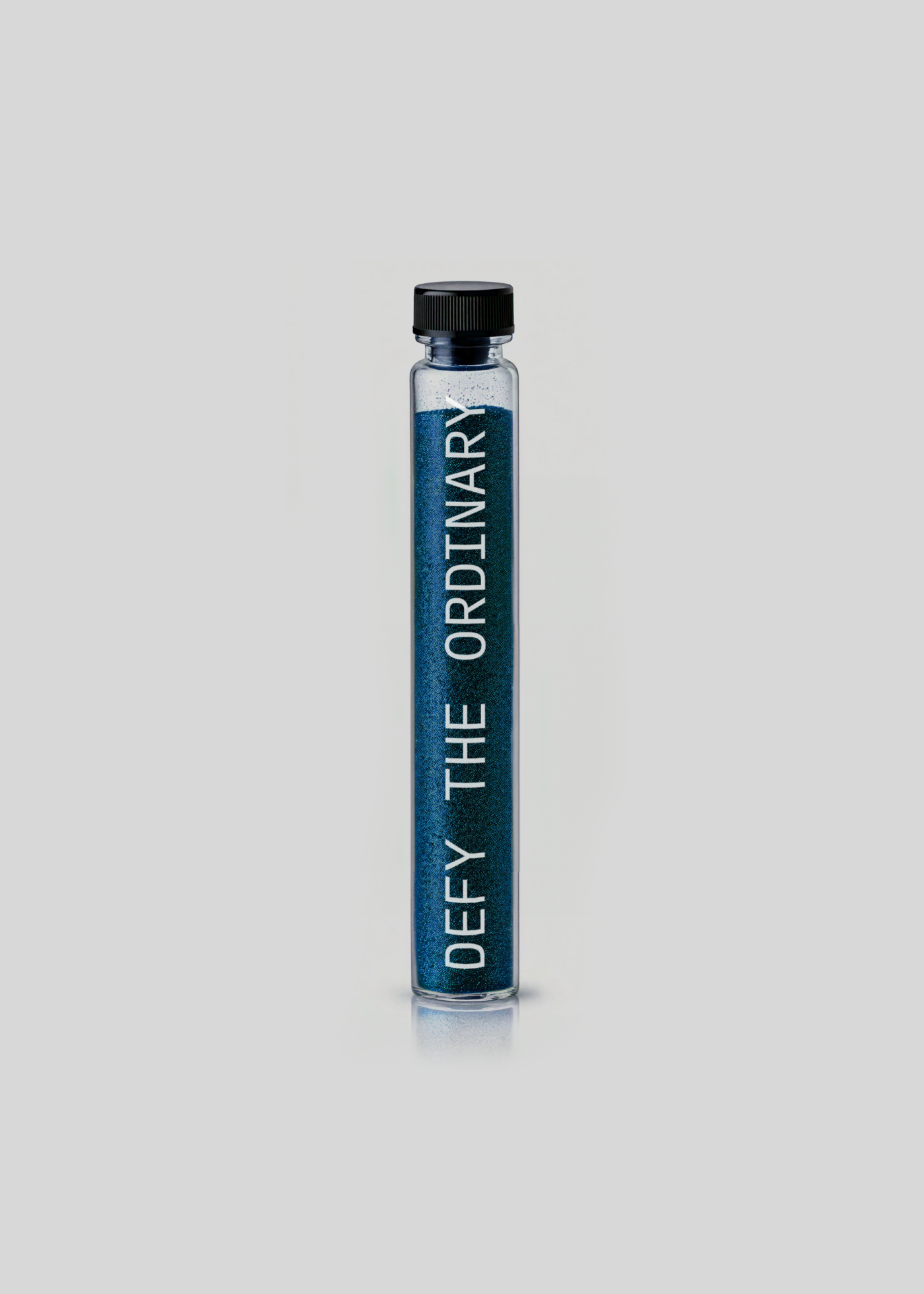
One of the common challenges faced by many B2B companies is their tendency to focus exclusively on product benefits, often overlooking the development of a distinct and tangible brand personality. To address this, we carefully reviewed YOC's entire suite of branding assets and guidelines, working to refine and elevate their brand presence. Among the most noticeable changes are the use of dynamic sparkles, adaptable for every ad concept and showcased on real devices in expansive viewports. Additionally, line drawings are now reserved solely for illustrations, giving the brand a more cohesive and polished visual identity. Behind the scenes, we implemented a completely new backend infrastructure with an updated CMS, empowering YOC to keep their website current and to present their latest innovations in the most impactful way possible.
3
Solution
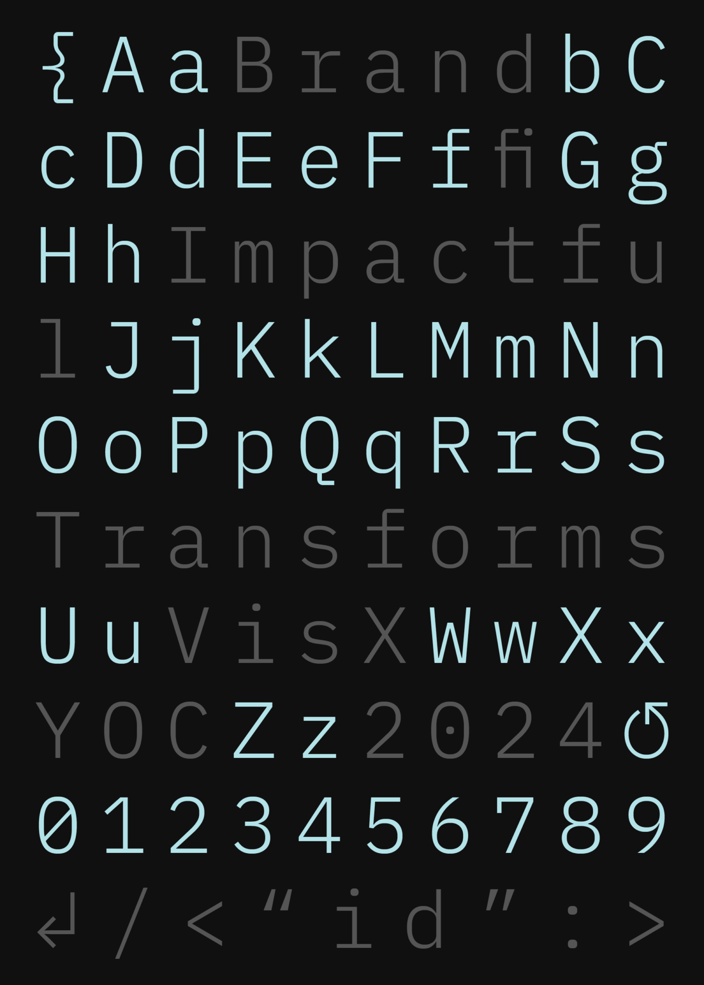
We meticulously refined the color palette, expanding it to better suit the enhanced digital environment while ensuring it offers flexibility for future content creation and adjustments. This refreshed palette provides a cohesive yet adaptable visual foundation for YOC’s evolving brand. To subtly reference the company's AI-driven services and its role as a leader in technology development, we introduced IBM Plex Mono into the updated branding. This modern typeface contributes to a more distinct and sophisticated visual identity, one that effectively communicates YOC’s core values while enhancing its presence across digital platforms.

