OM®
Brand Identity and Packaging Design for a German Skincare Brand

Services Provided
- Branding
- Brand Strategy
- Packaging
- Web Design
- Photo Production
- Video Production
Specs
Services Provided
- Branding
- Brand Strategy
- Packaging
- Web Design
- Photo Production
- Video Production
Specs
1
Objective
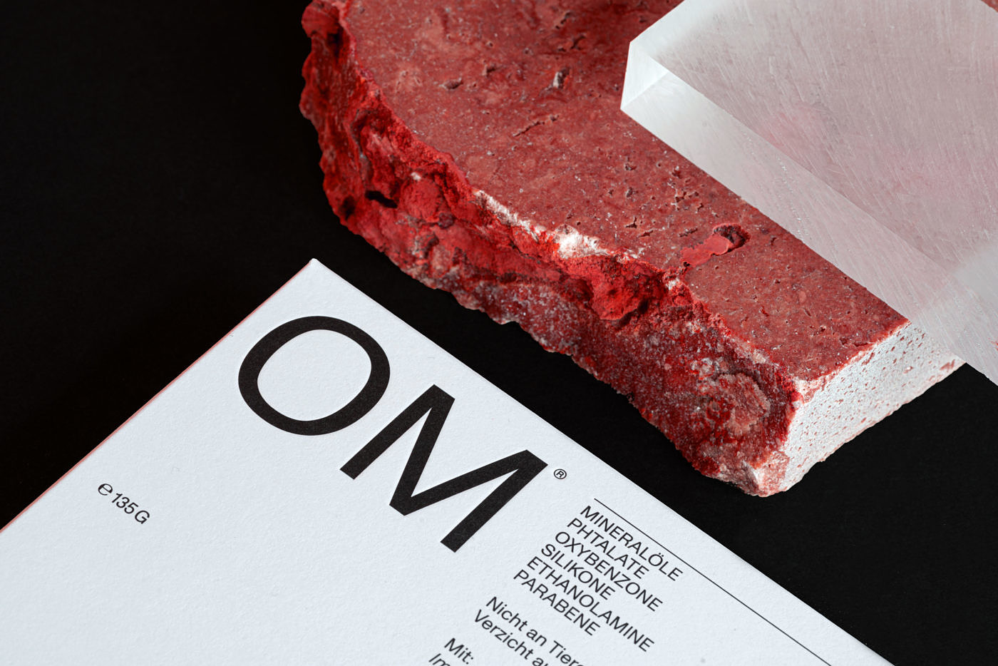
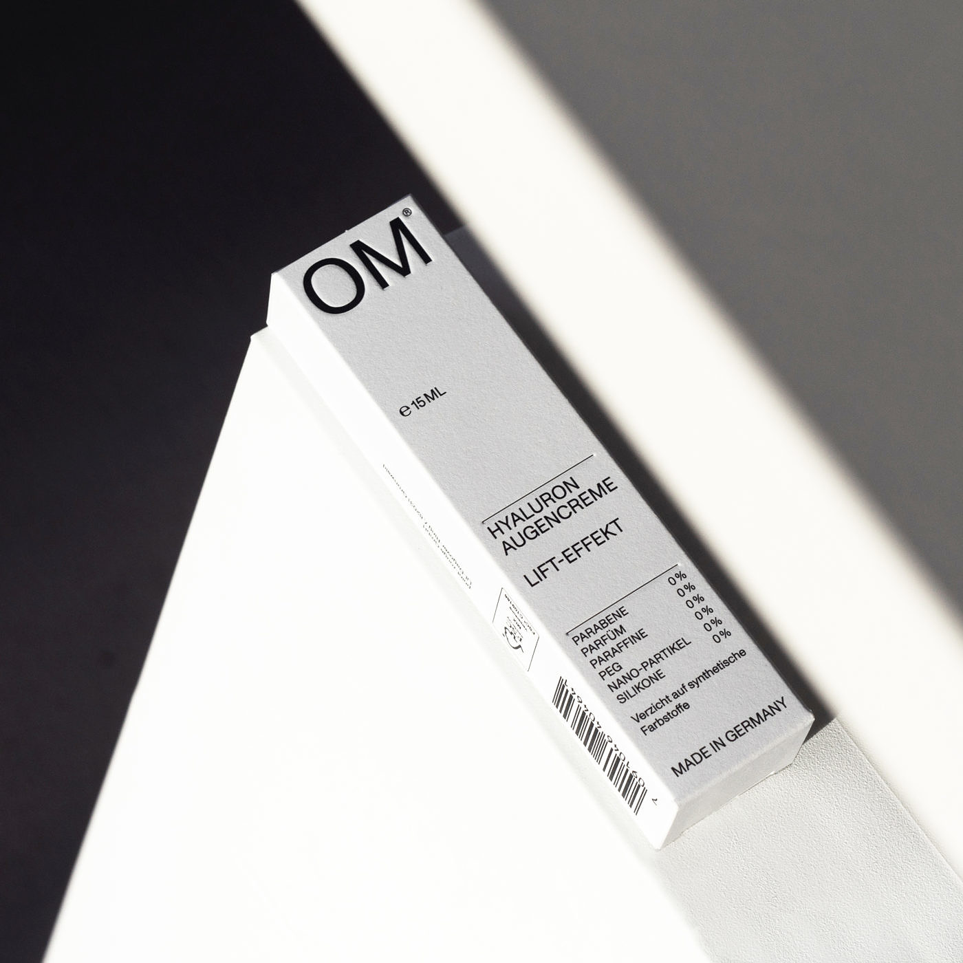
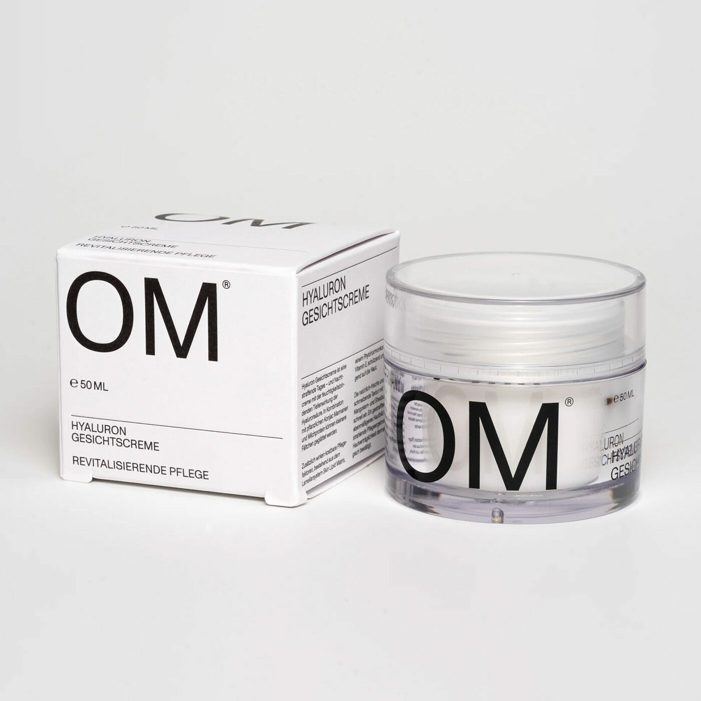
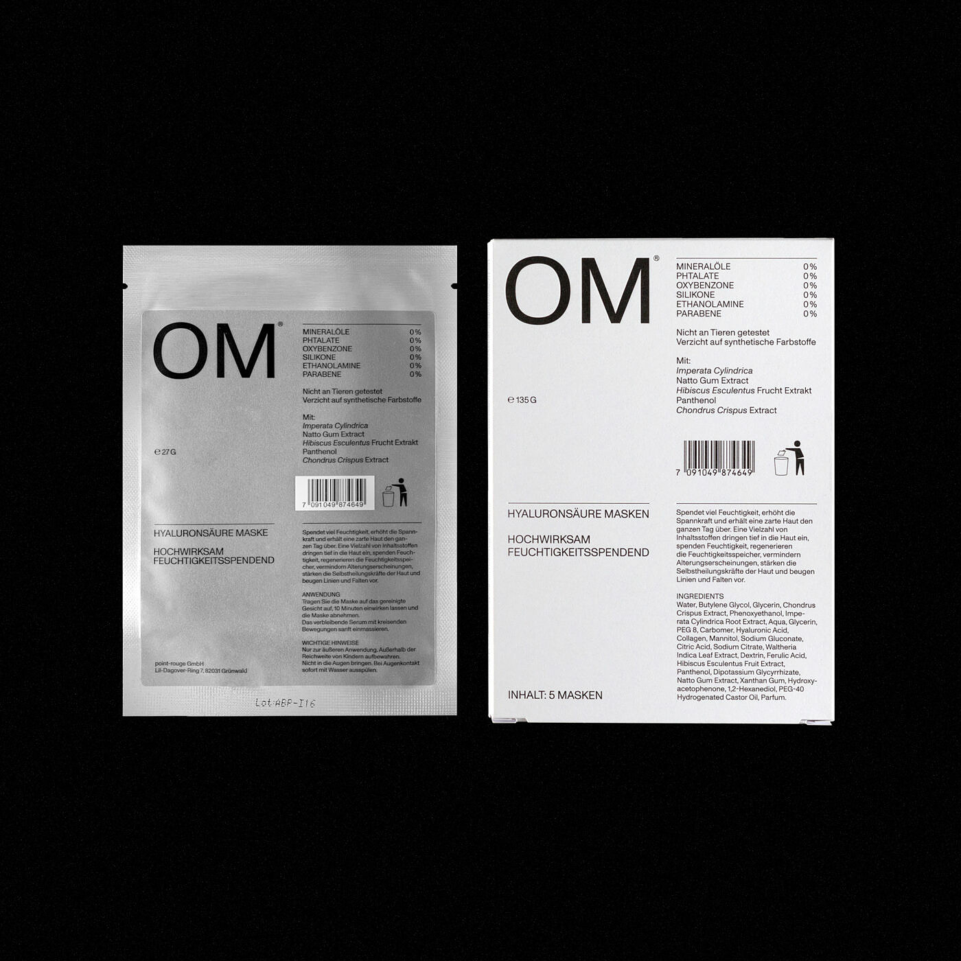
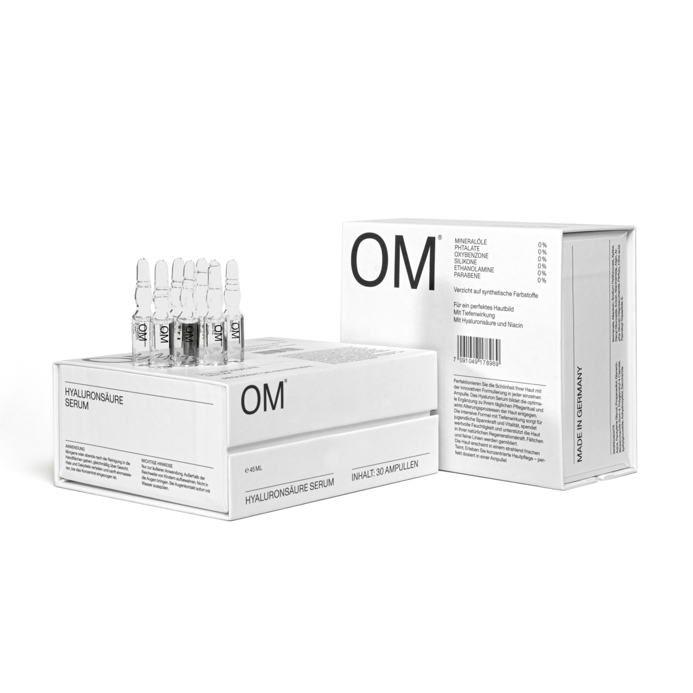
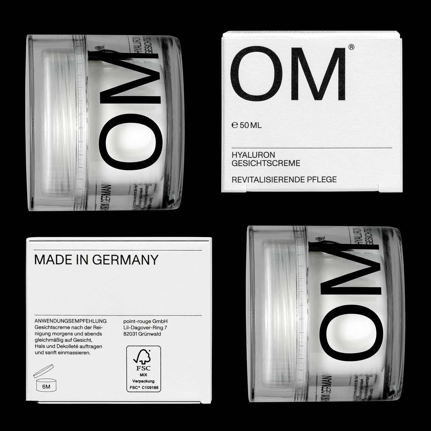
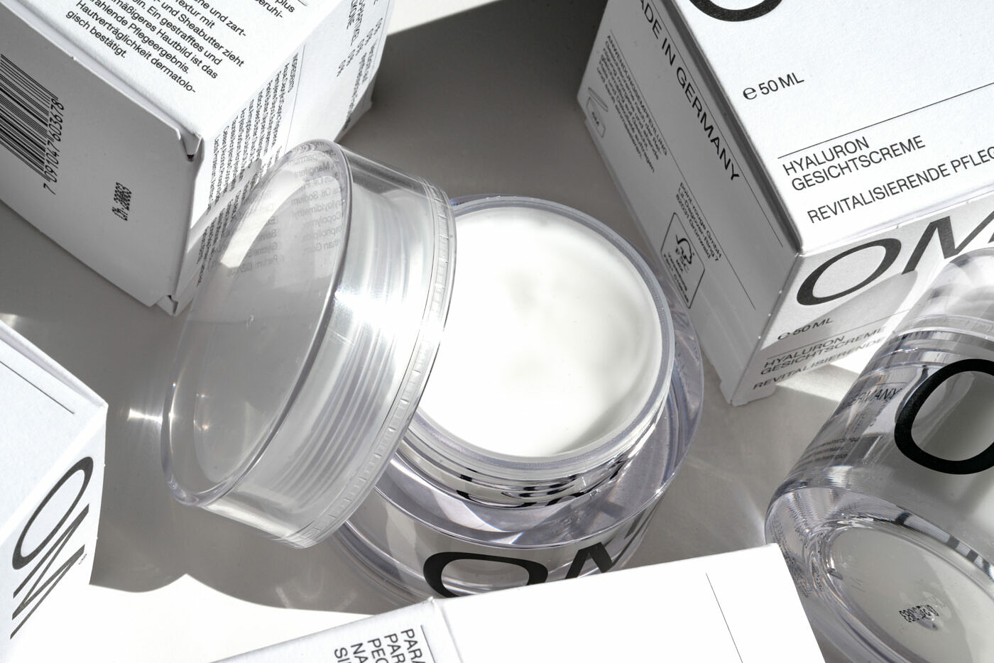
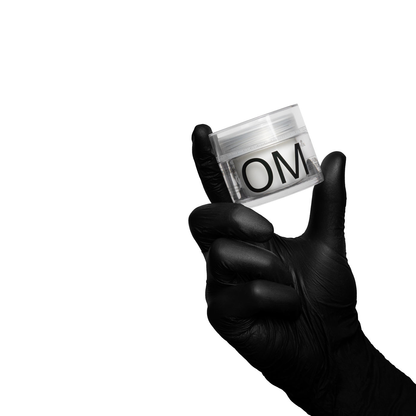
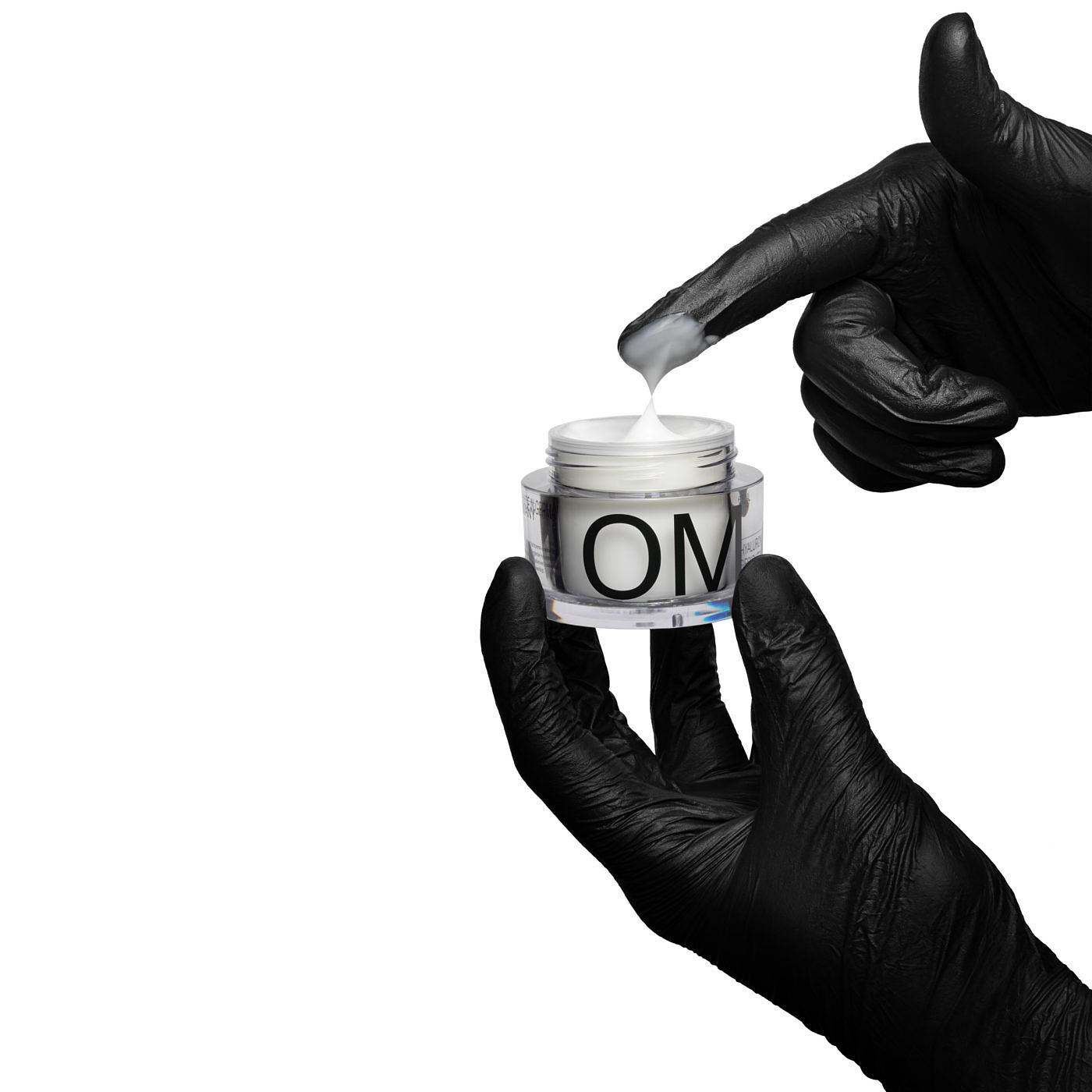
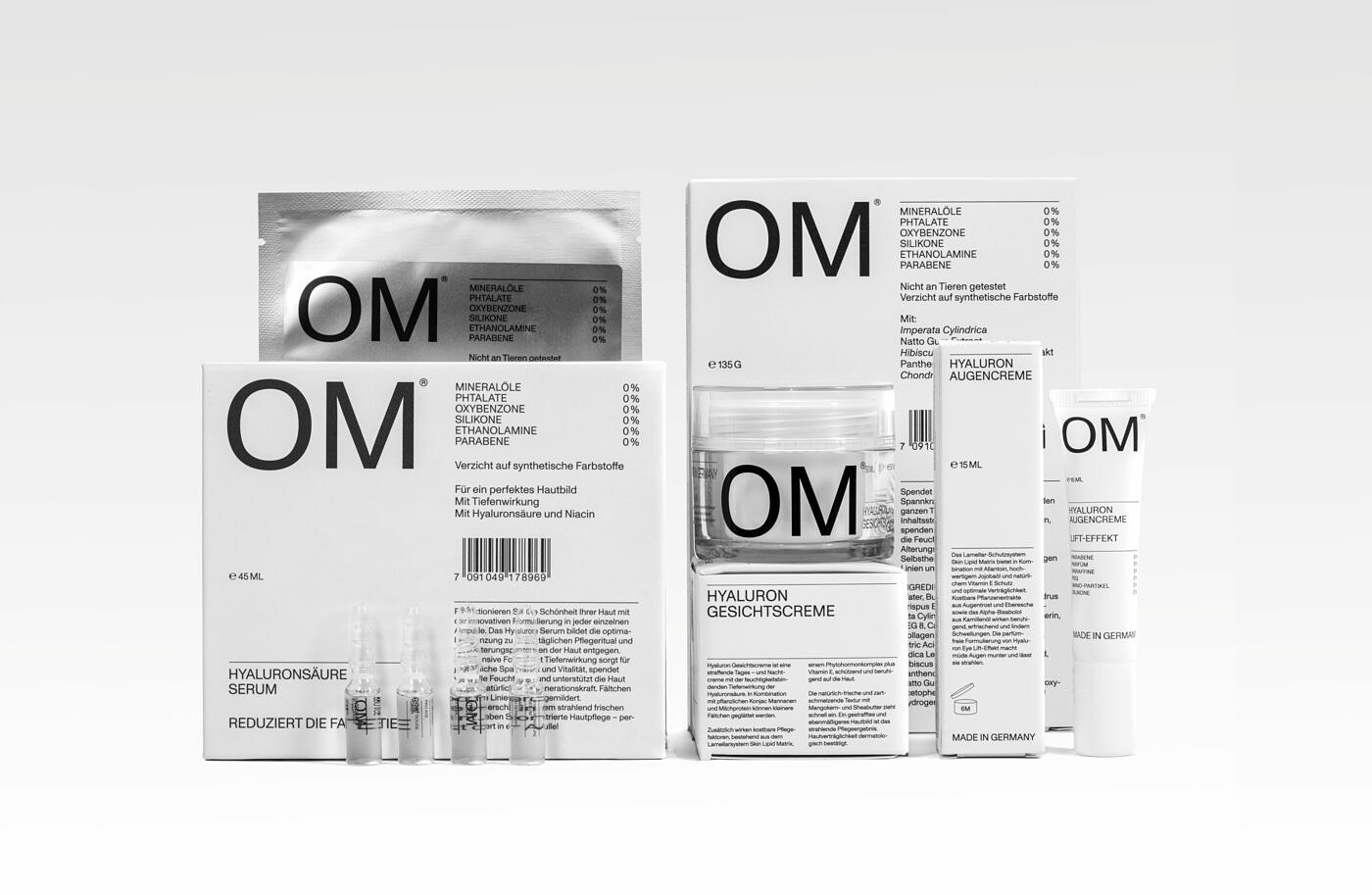
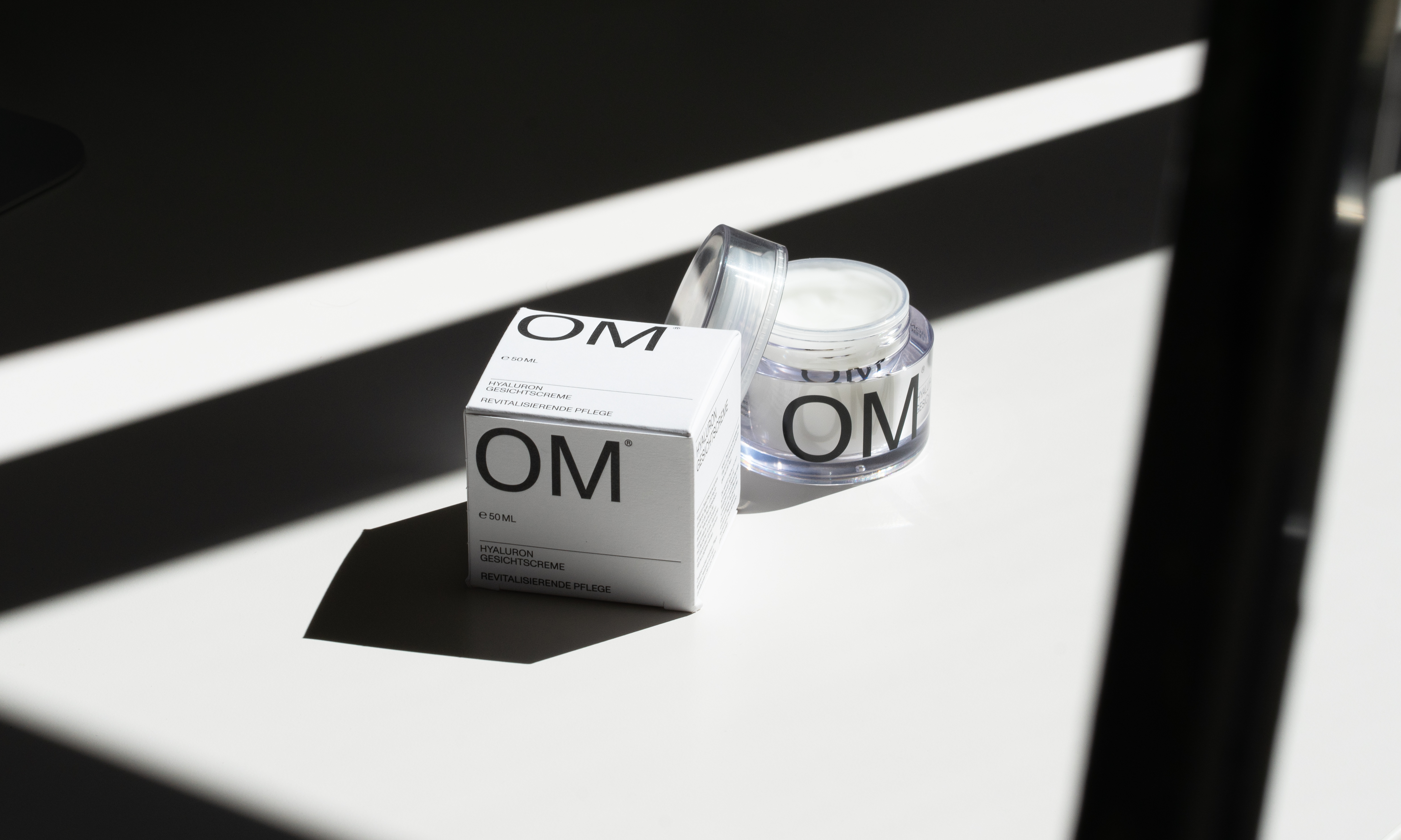
OM is a high-quality, clean beauty cosmetics brand that develops and produces all of its products in southern Germany. They approached us to create a comprehensive corporate identity including brand strategy and narrative, packaging and content creation for their first skincare range. It was important that we channel the quality and purity of the ingredients in the components that make up the brand. From the beginning, we wanted to create an identity that would put all the weight on the quality of materials, be as transparent and natural as possible, and would invite scrutiny and deconstruction. A somewhat architectural approach.
2
Approach
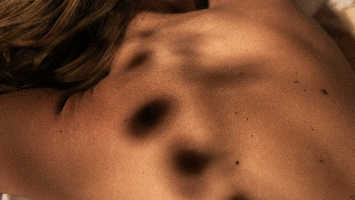
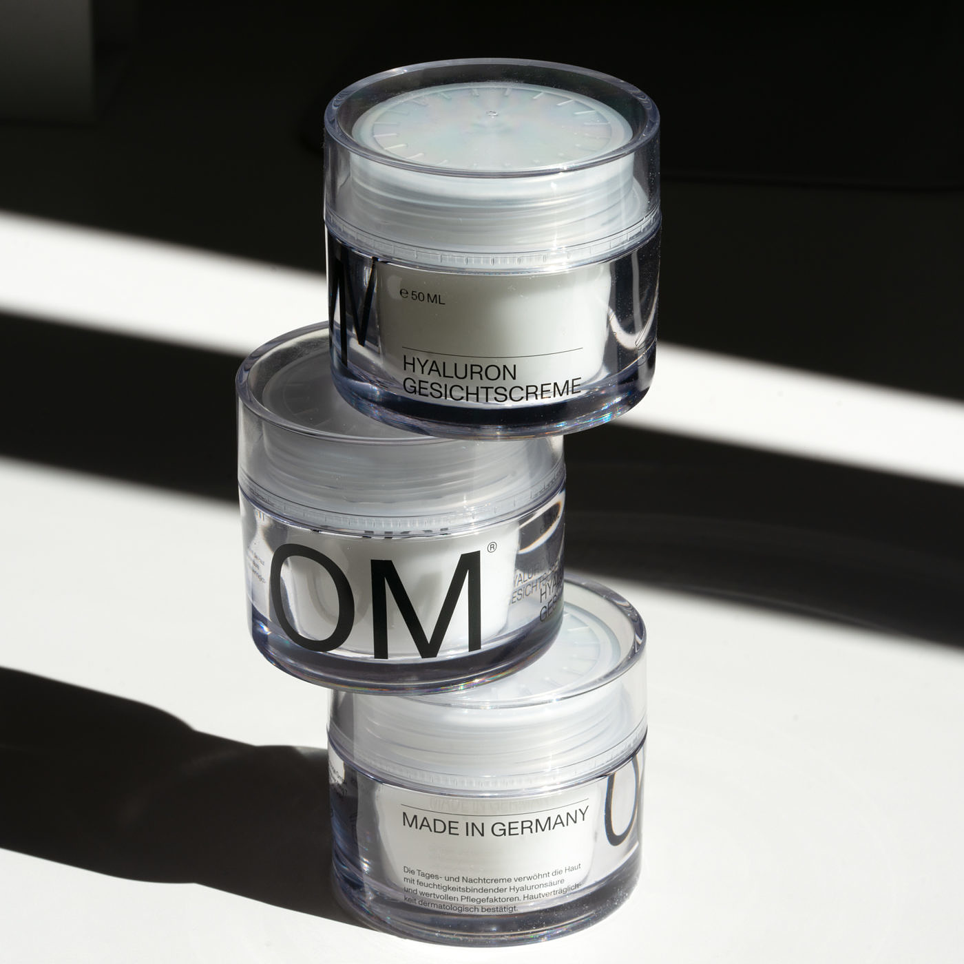
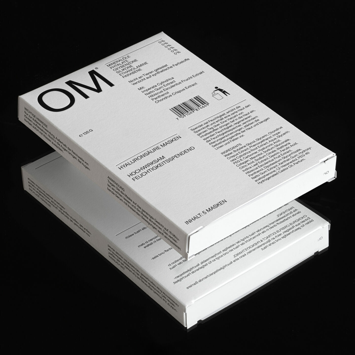
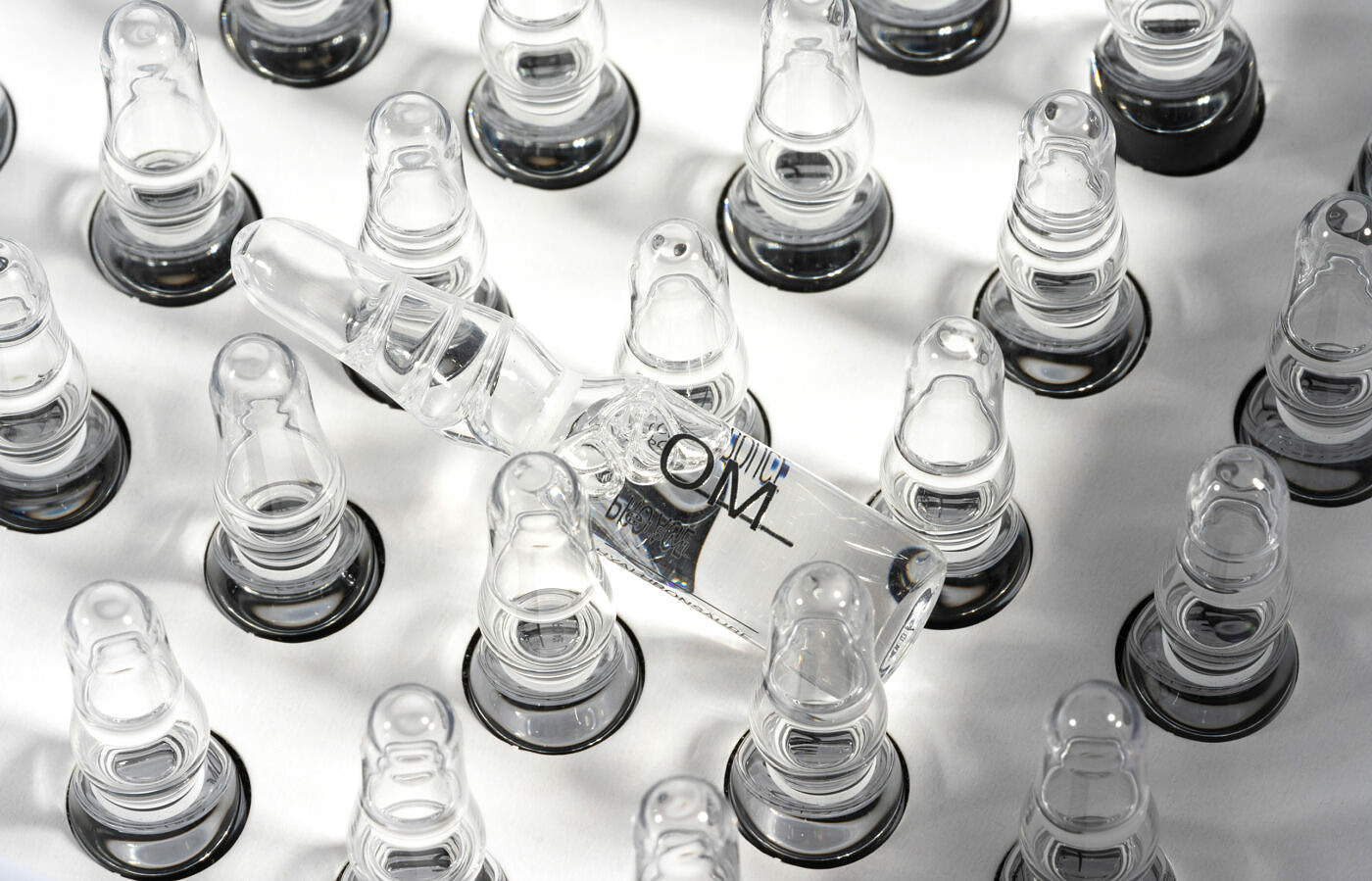
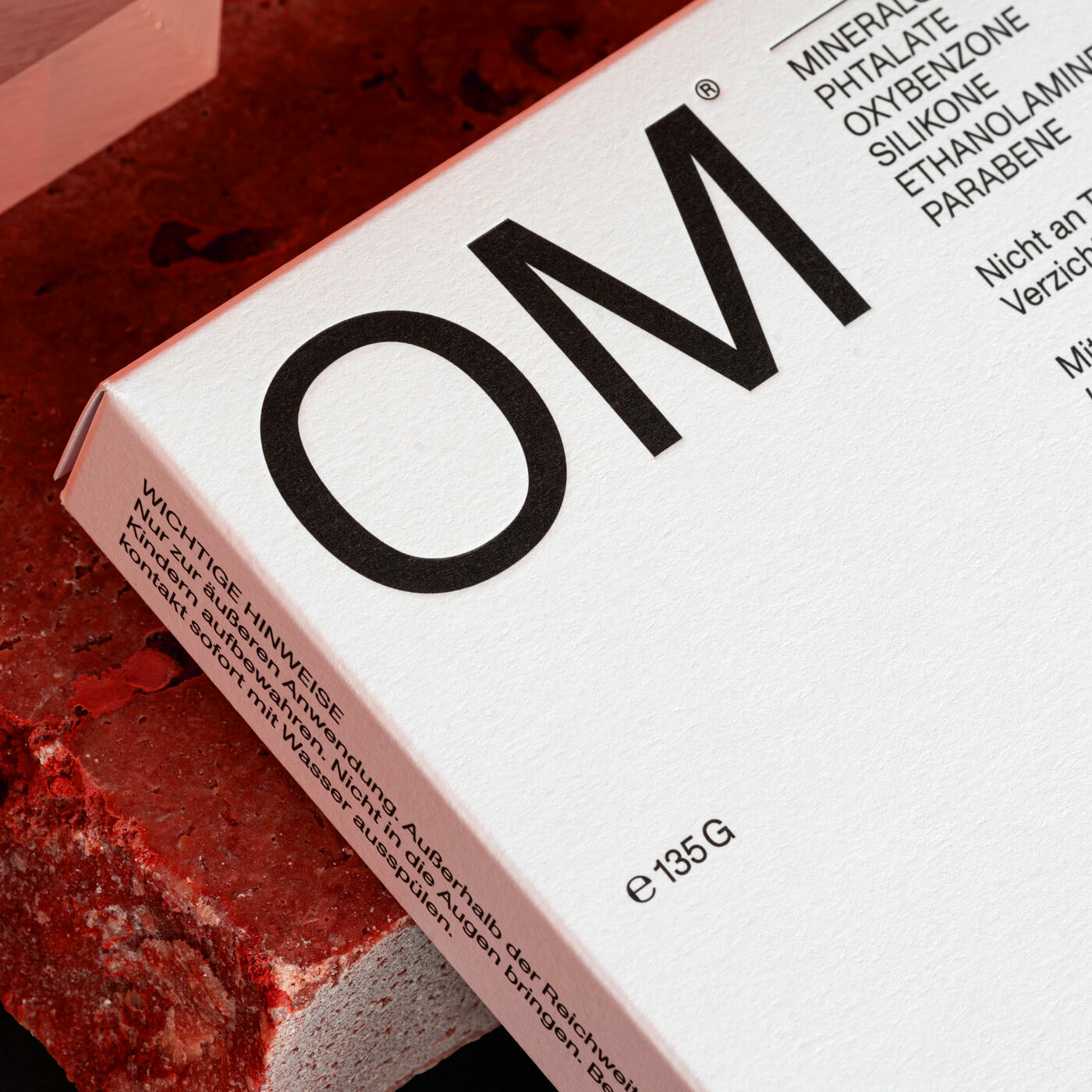
As the product is a physical object, we had the luxury of going outside the confines of graphic design and used the textures of the materials in the packaging (always left uncoated) as the brand color palette. Once this was set it was a question of a concise yet recognizable layout system that would give the product a strong identity while conveying all the necessary information. That brought us to the visual language based solely on one grotesk typeface. We used Monument Grotesk to create a proper typographic system that would be strong enough to carry the brand and allow us to scale it in the future.
3
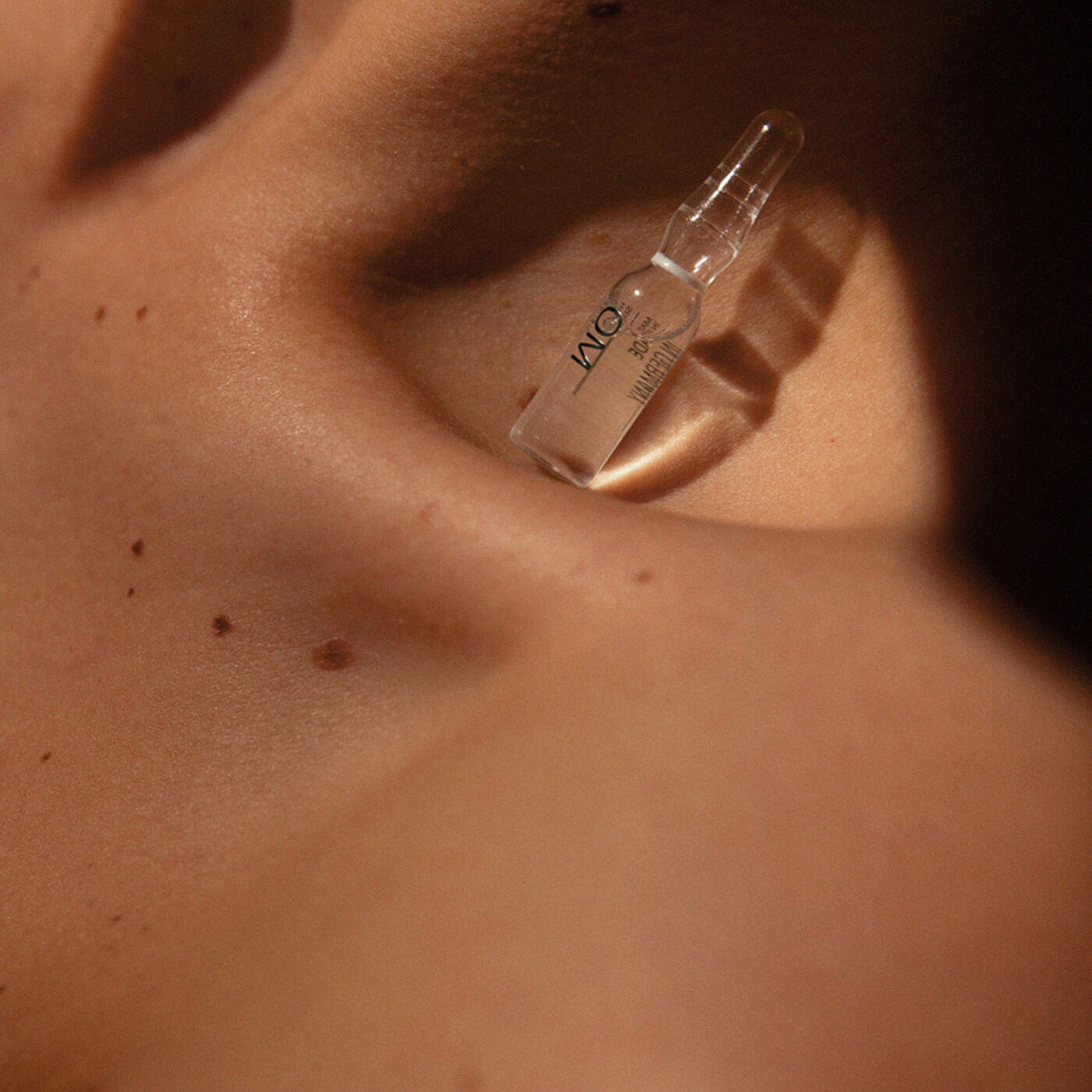
Solution
The packaging was kept clean and simple in black-and-white, with a ‘Made in Germany’ tag that is given a prominent place to communicate the premium nature of the product. Raw but delicate textures and colors of the packaging work as the background for the typography and are the only kinds of decoration we used. As light and its interaction with the object were important from the beginning, we used vintage lenses that can reproduce light in a very natural way. We used direct daylight and intricate shadows it produces. The resulting object was what we were thinking of when designing.