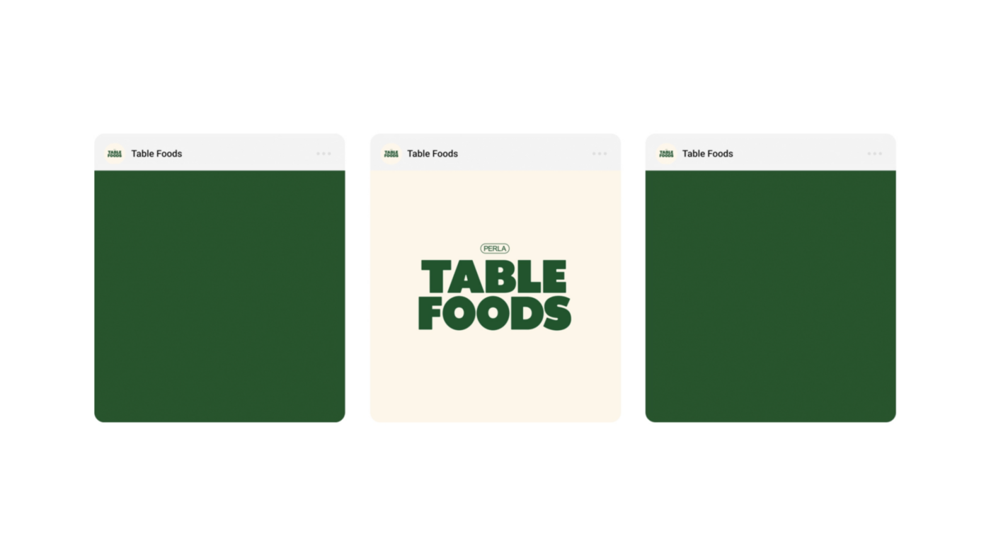
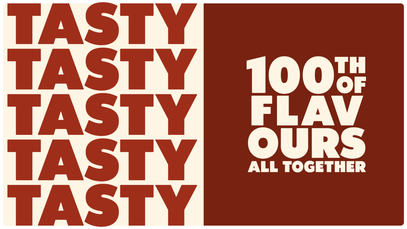
Table Foods
Reimagining the ready-to-eat experience, reflecting the zeitgeist
Services Provided
- Brand Strategy
- Naming
- Copywriting
- Visual Language
- Packaging
- Typeface Design
- Campaign Ideation
- Campaign Production
Specs
Services Provided
- Brand Strategy
- Naming
- Copywriting
- Visual Language
- Packaging
- Typeface Design
- Campaign Ideation
- Campaign Production
Specs
1
Objective
Perla, one of the big players in the german food market, approached us in 2020 with their vision of a plant-based and environmentally friendly food company. They were willing to reinvent their established but out-dated brand image to emphasise their plant-based offerings and commitment to sustainability. The objective covered everything from the brand's name to its visual identity and packaging, as well as its communication and campaign production. The result of our collaboration is sure to shake up the ready-to-eat food market and reflect our zeitgeist of why & what we consume.
2
Approach
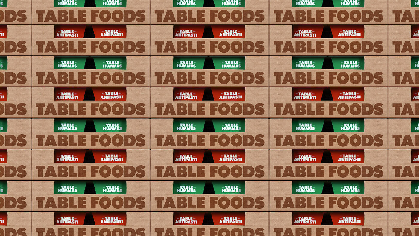
Since we started from scratch, we reflected on how and with whom people eat — coming back to the table where everything happens. Our brand positioning focuses on positive change, smart innovation, and a healthy diet. This is translated into a lively and playful tonality, addressing the different target groups of the two main product categories. Visually the identity had to organize the various products, have the ability to scale easily, and to stand out in a competitive market environment.
3
Solution
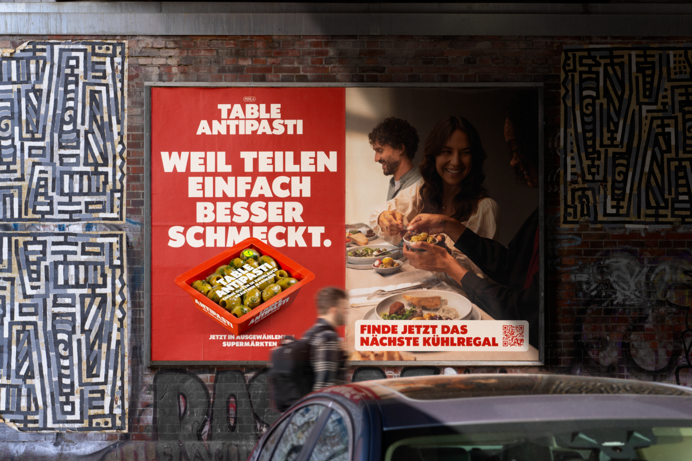
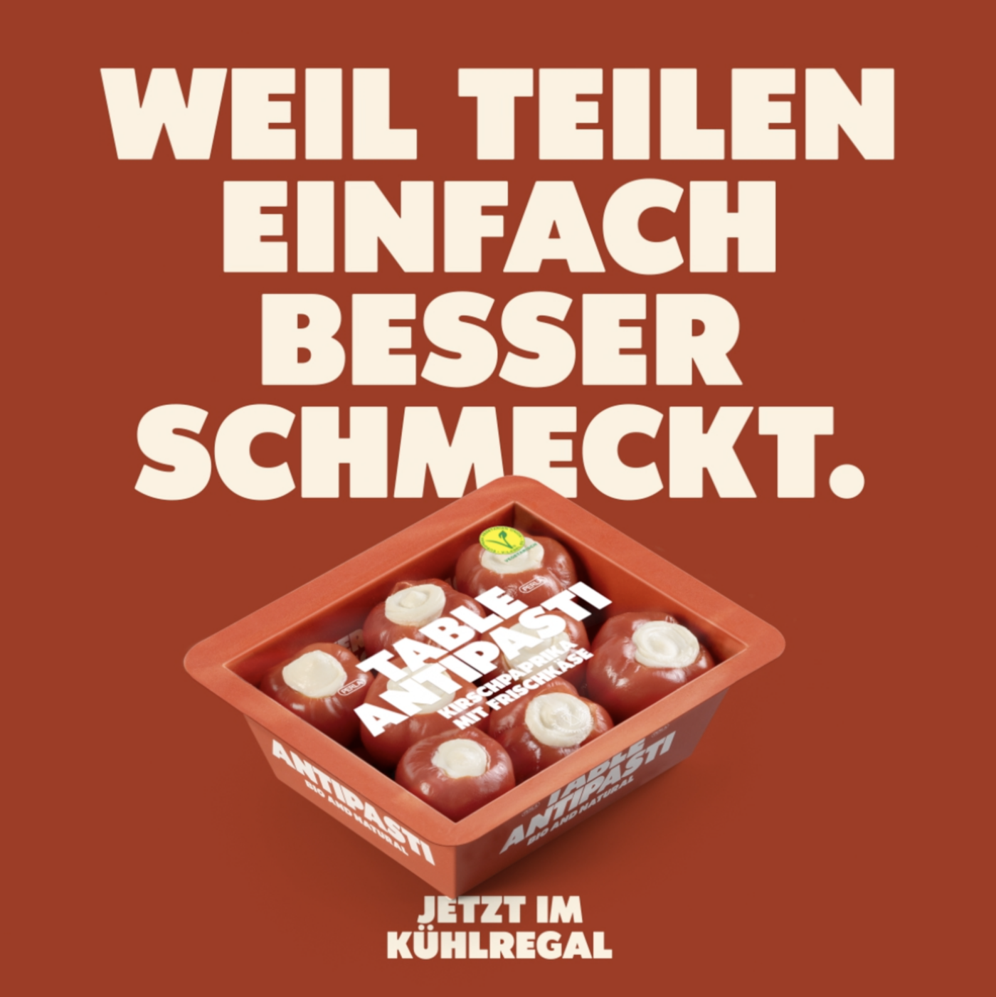
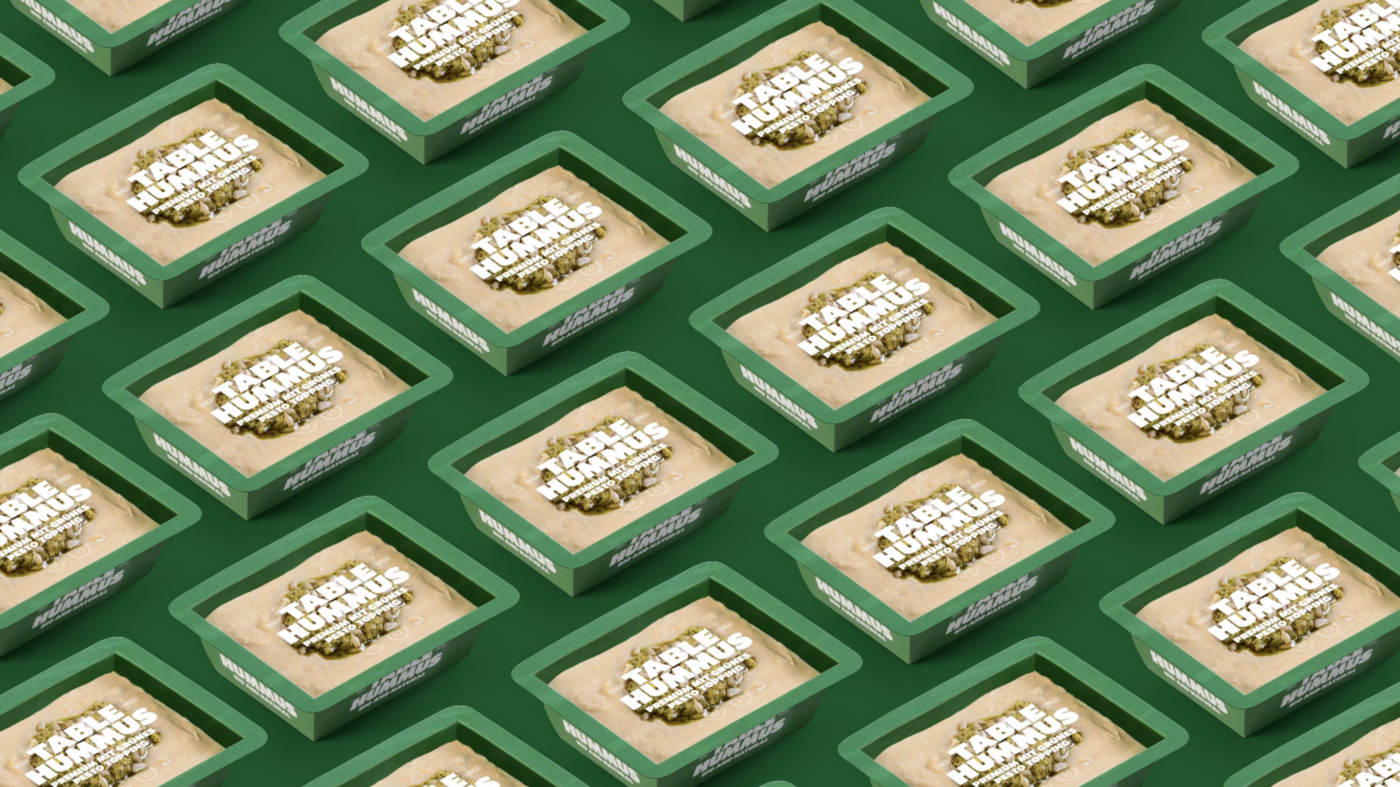
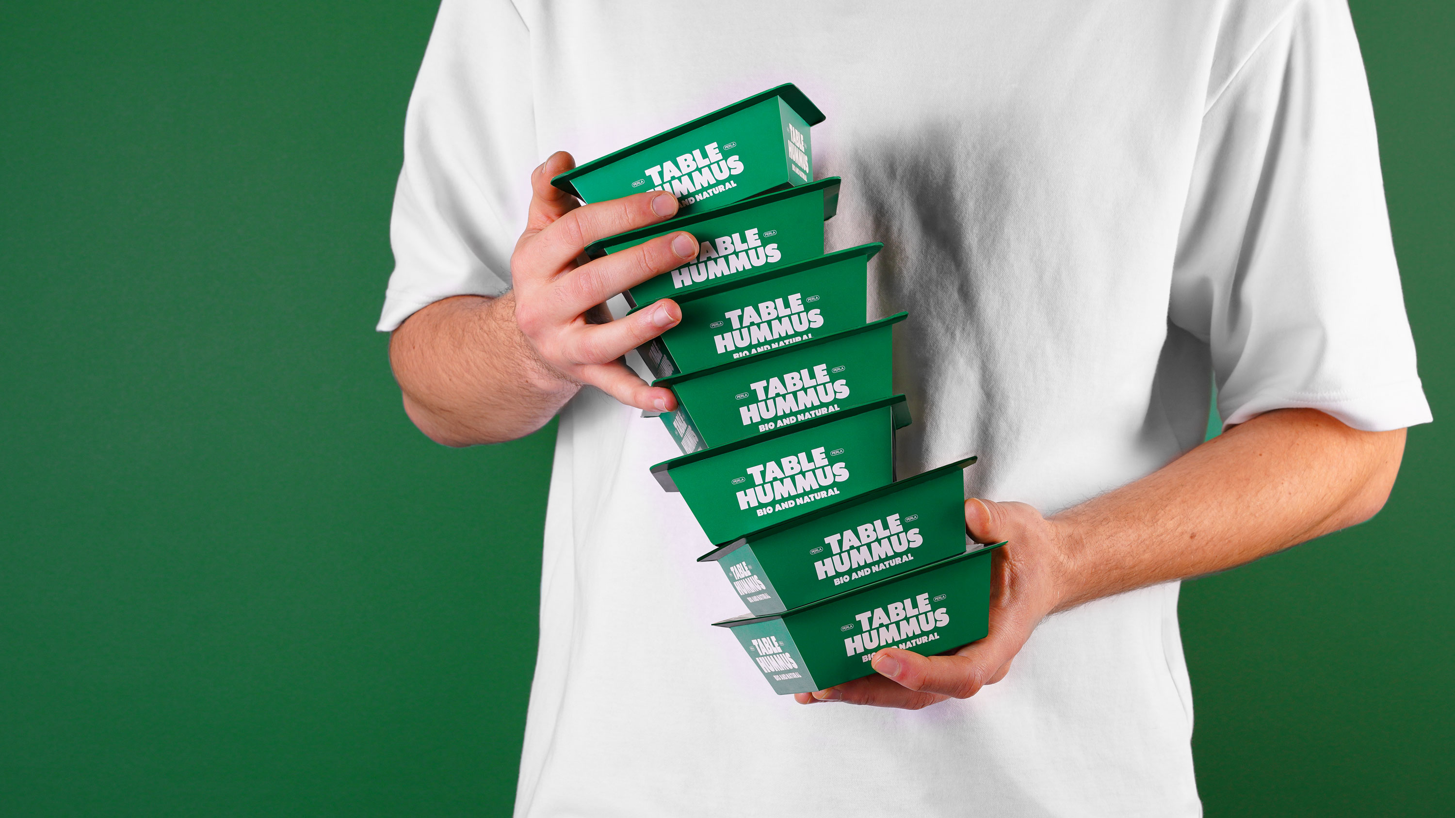
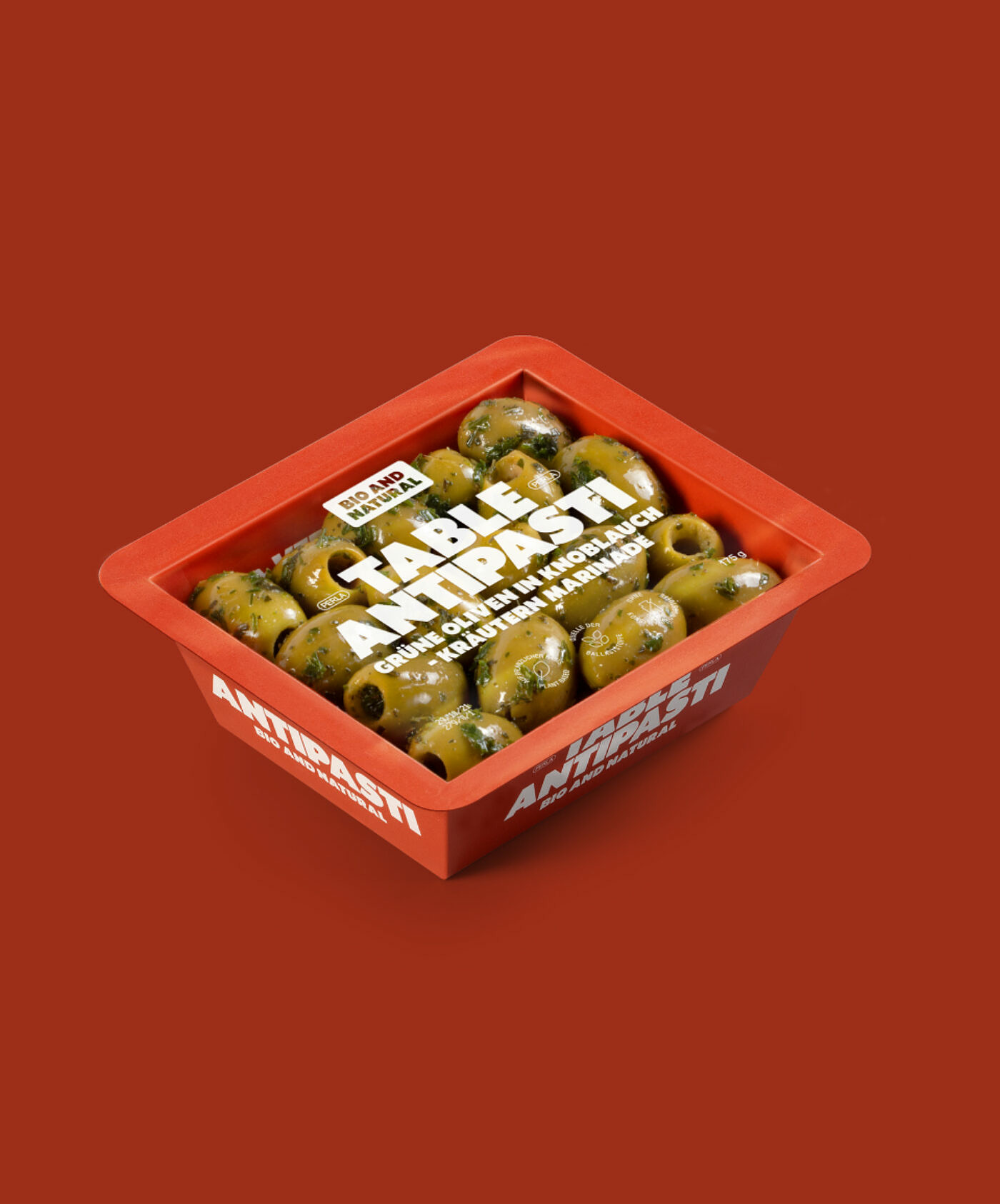
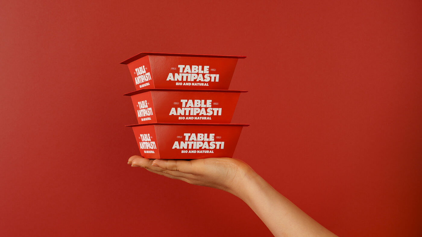
The starting point for our identity was a relatively unknown Grotesque from the early 20th century and the playful use of the word "teilen" (german for "to share" & "to divide") that is used both verbally and visually to promote the concept "Gemacht zum teilen." (german for "Meant to be shared."). The paper-tray packaging provided an excellent foundation for applying a modern, organized system, while the bold colors and ambiguous slogans positioned the brand at eye level.


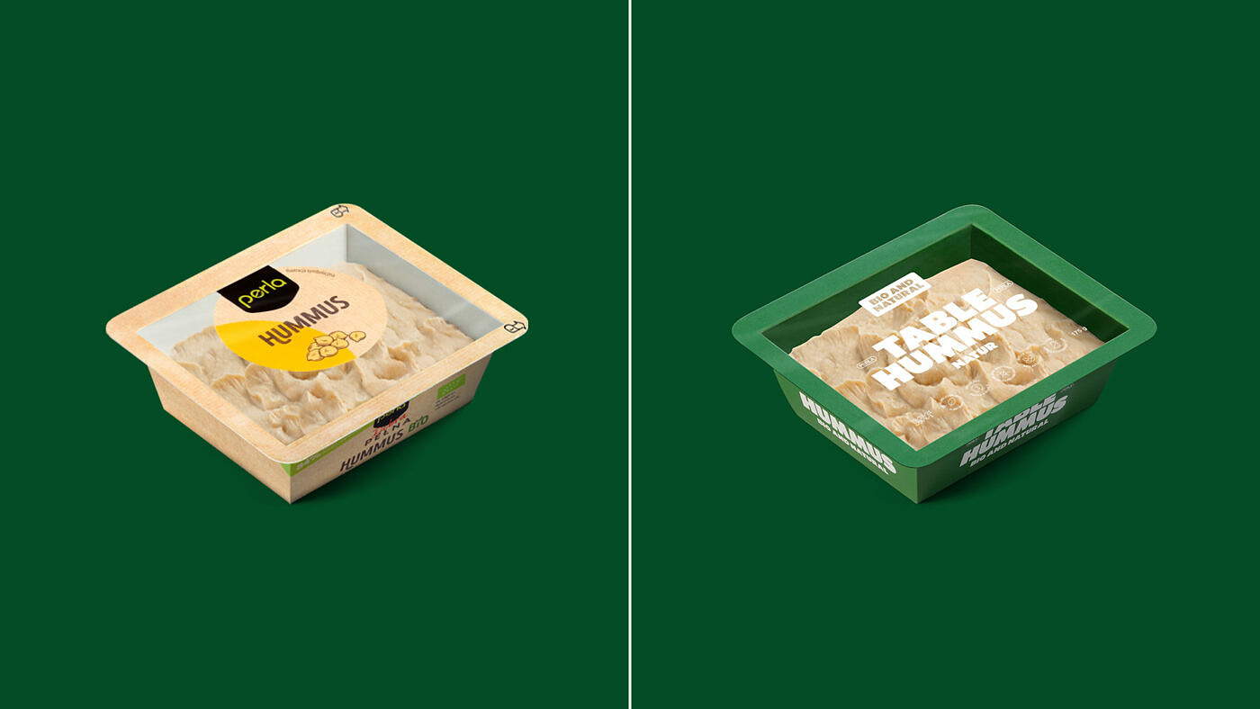
Perla’s visual appearance has changed to a more sophisticated, mature and honest appearance, which puts the focus on the product. The omission of decorative elements simplifies the layout. Clean, well-organized top lids make it convenient for consumers to identify product content and its benefits & quality. As a result, the design has a premium look & feel and stands out among its competitors on the cooling shelf.
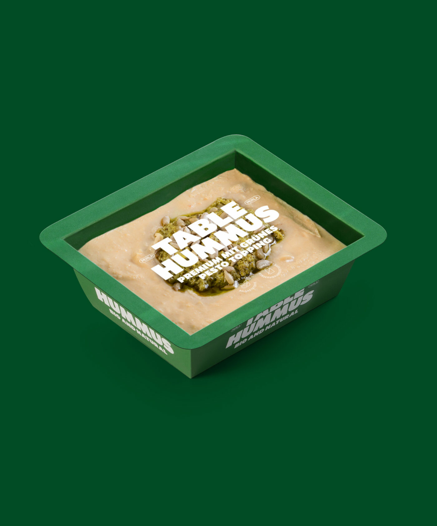
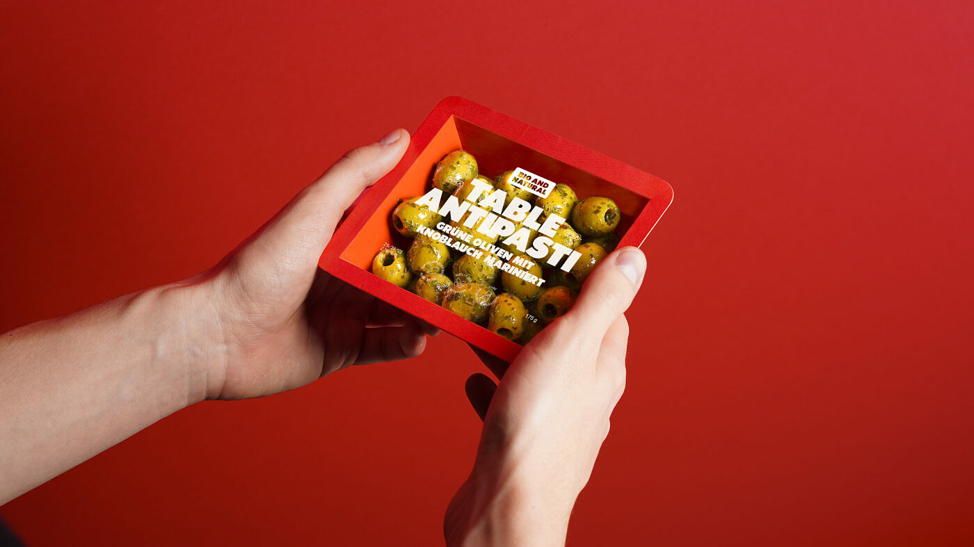
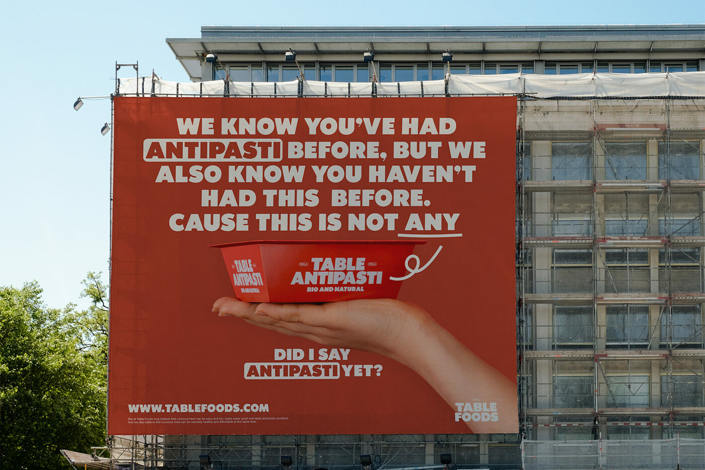
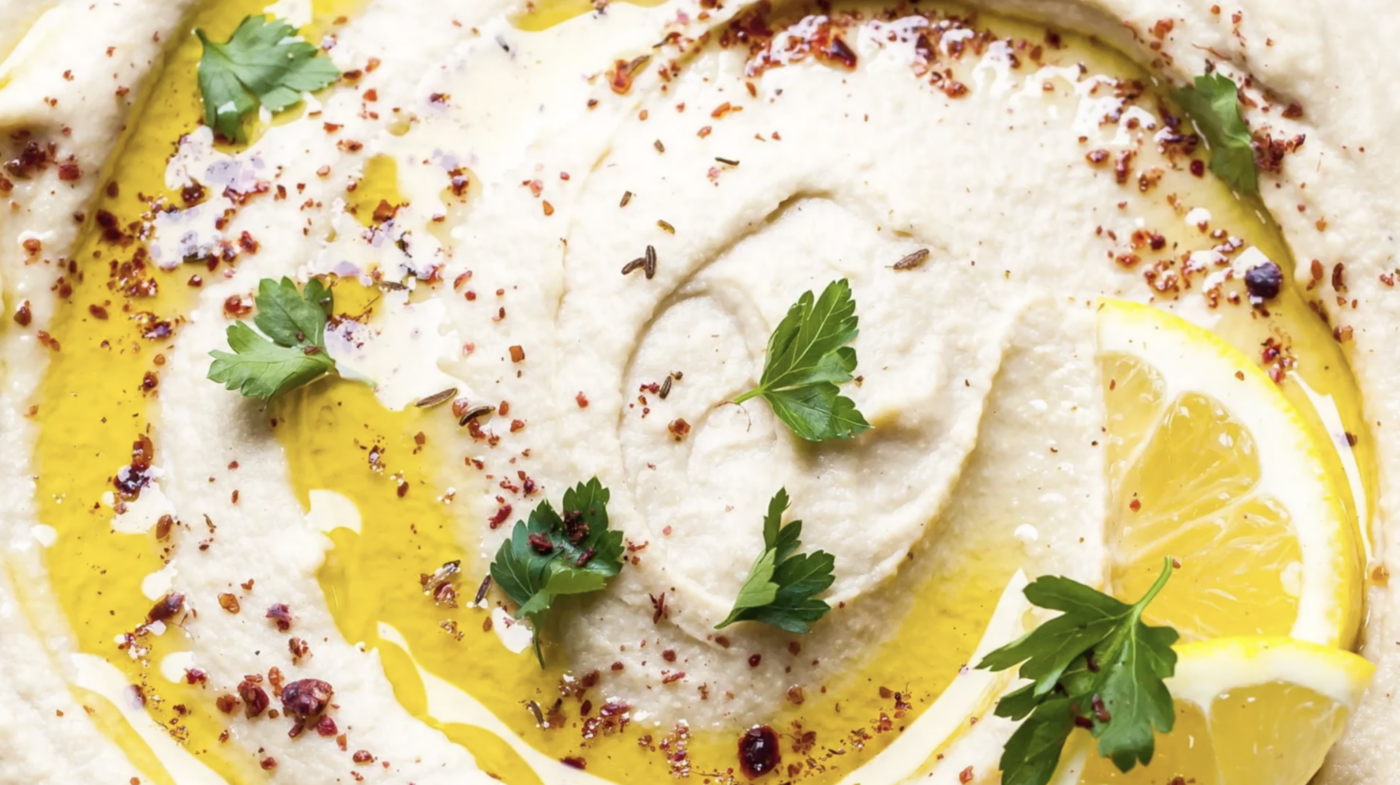
When designing the packaging, we had two big objectives: make it stand out from the masses of ready-to-eat products and uncover it from shallow claims and meaningless serving suggestions. With the newly developed paper-tray packaging, which uses 84% less plastic than the previous packaging, we implemented a layout that ticked the boxes and worked for all products—combining prominent recognizable branding with informative icons. The result is packaging that not only stands out because of its use of paper but also thanks to its combination of colorful & bold branding. In addition, it has a big transparent top foil that displays the freshness and quality of the product.
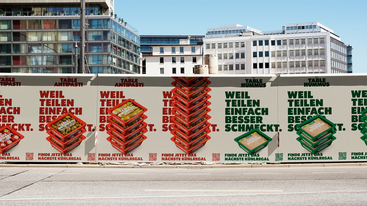
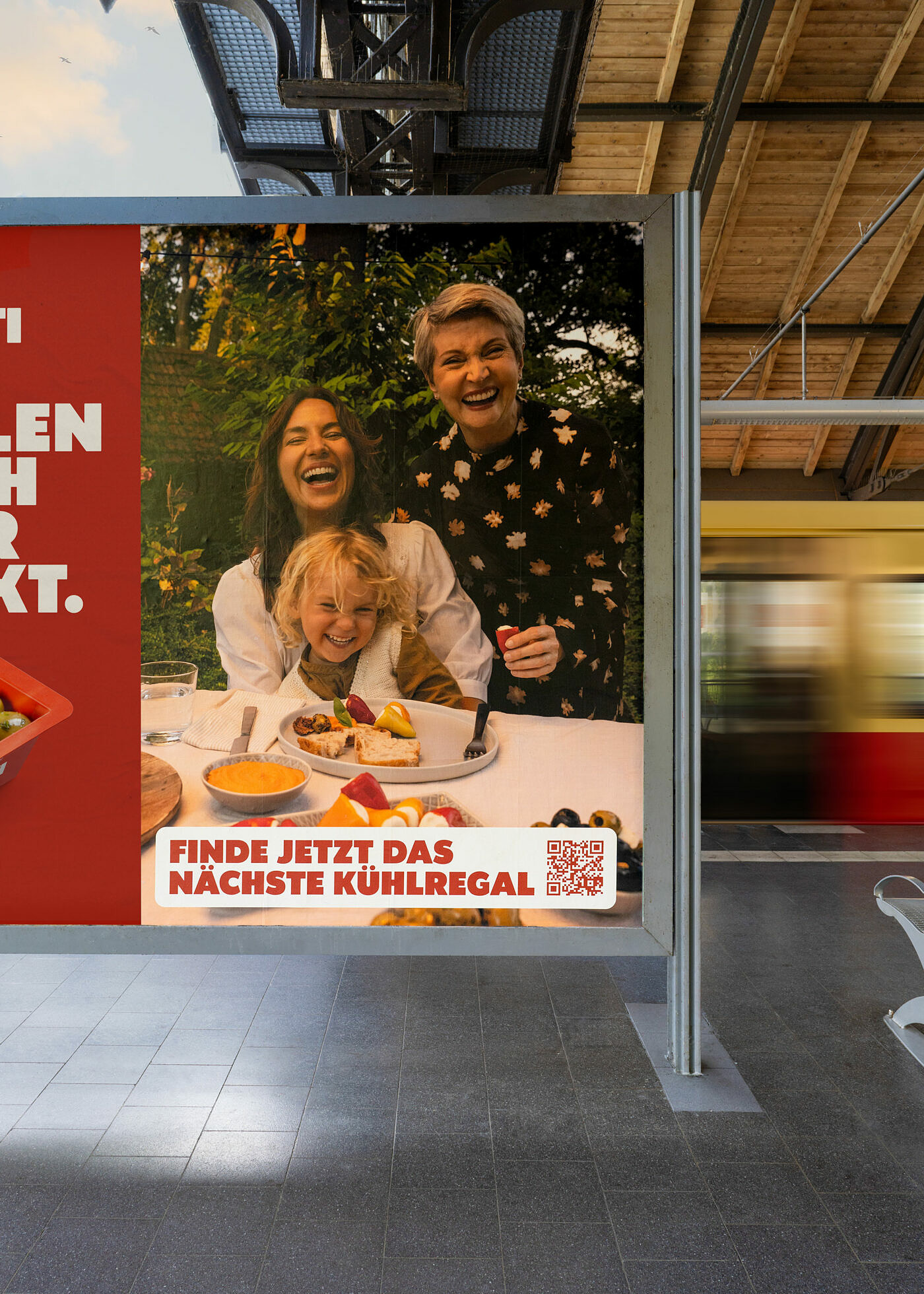
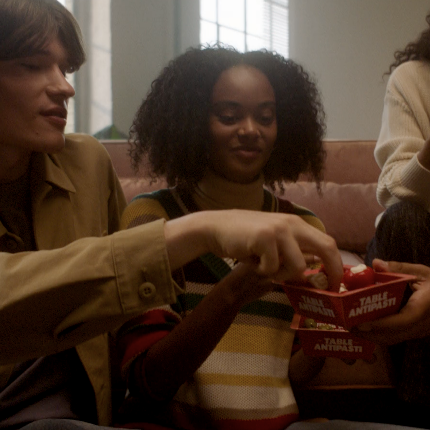
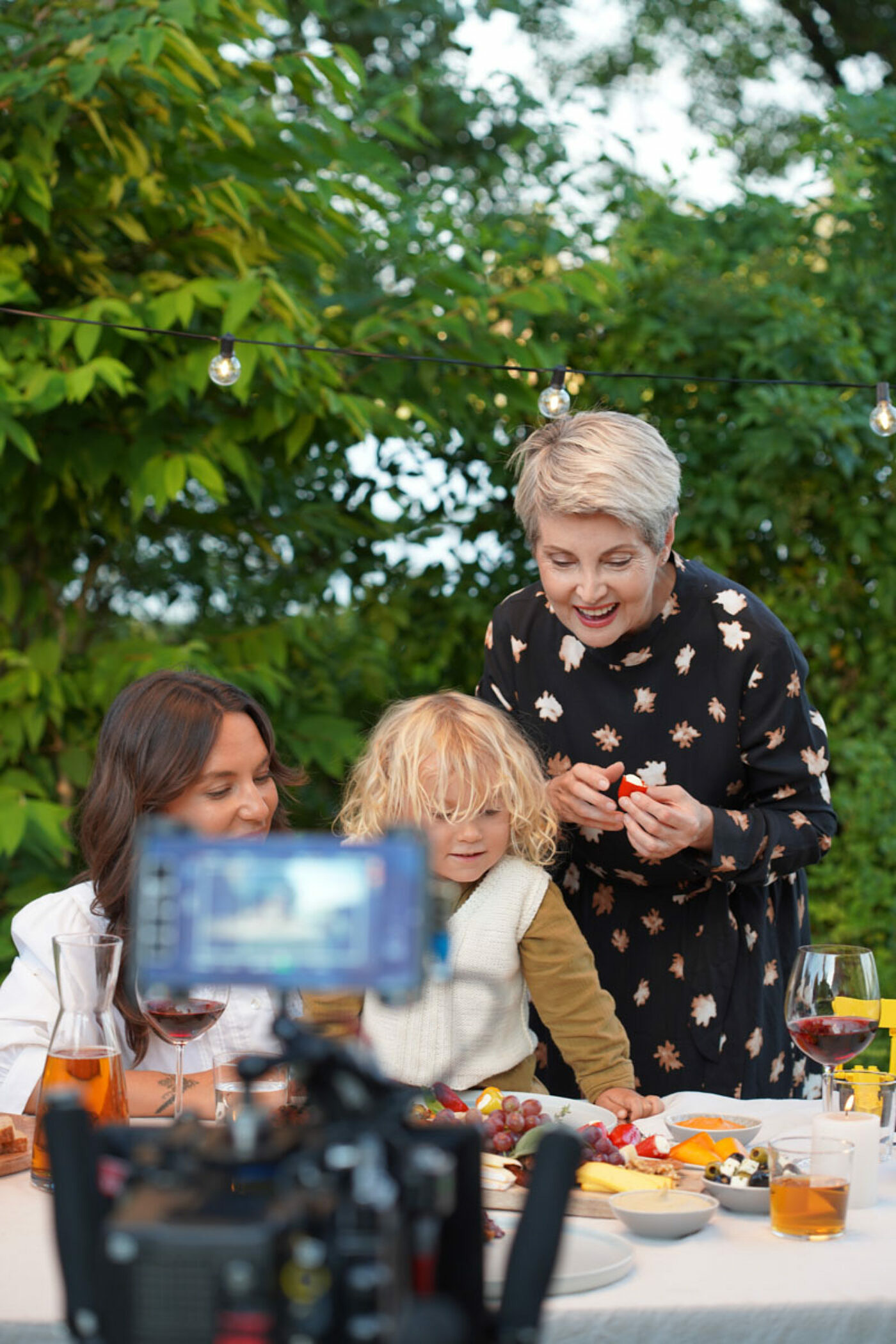
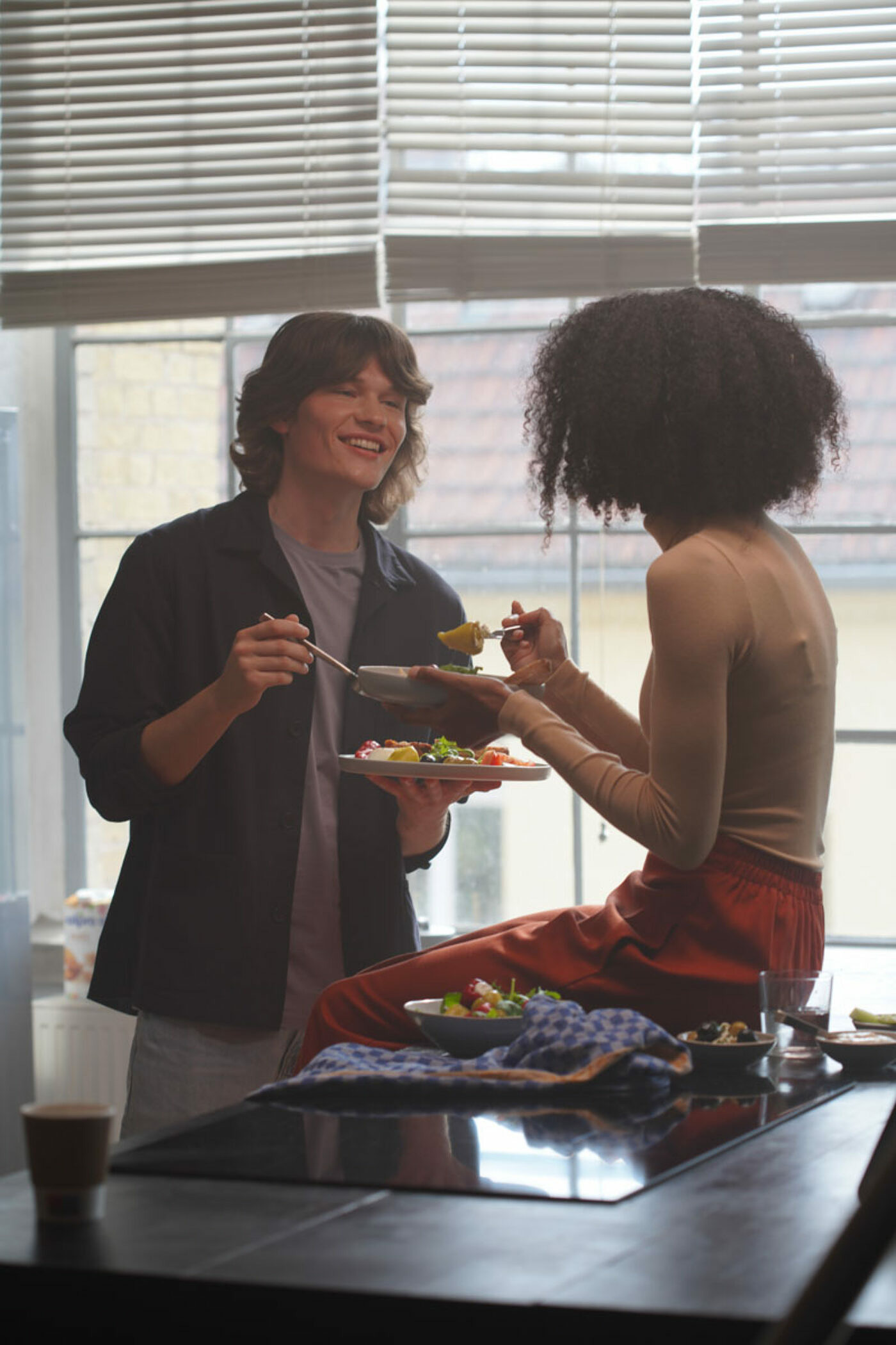
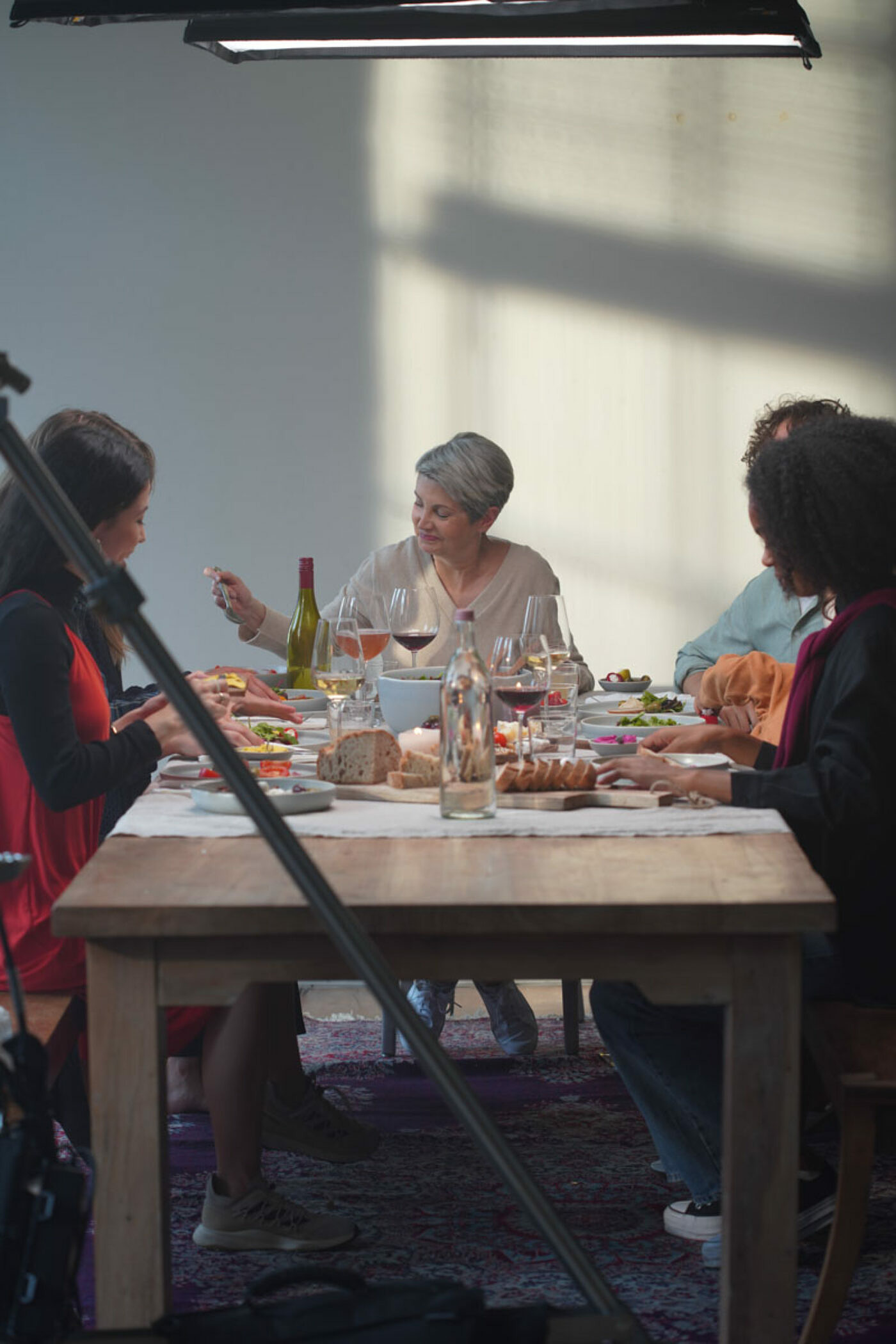
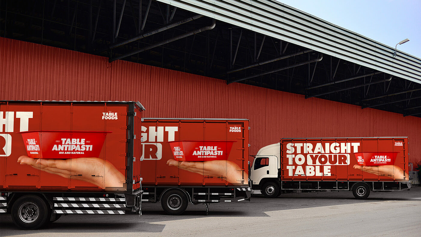
The campaign had to be implemented simultaneously across the entire German market and in time with the introduction of the redesigned retail packaging. To get the most out of this roll-out, we connected this campaign with the new brand look & feel of “Alle zusammen”. Our campaign imagery depicts a diverse cast of people enjoying antipasti or hummus at breakfast, between meetings, or during a spontaneous dinner with friends. Showing the consumer how convenient and versatile Table Food’s products are.
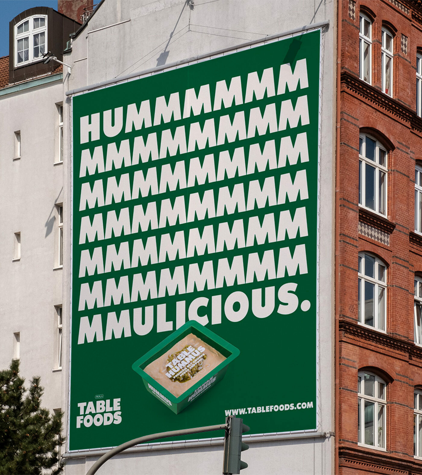

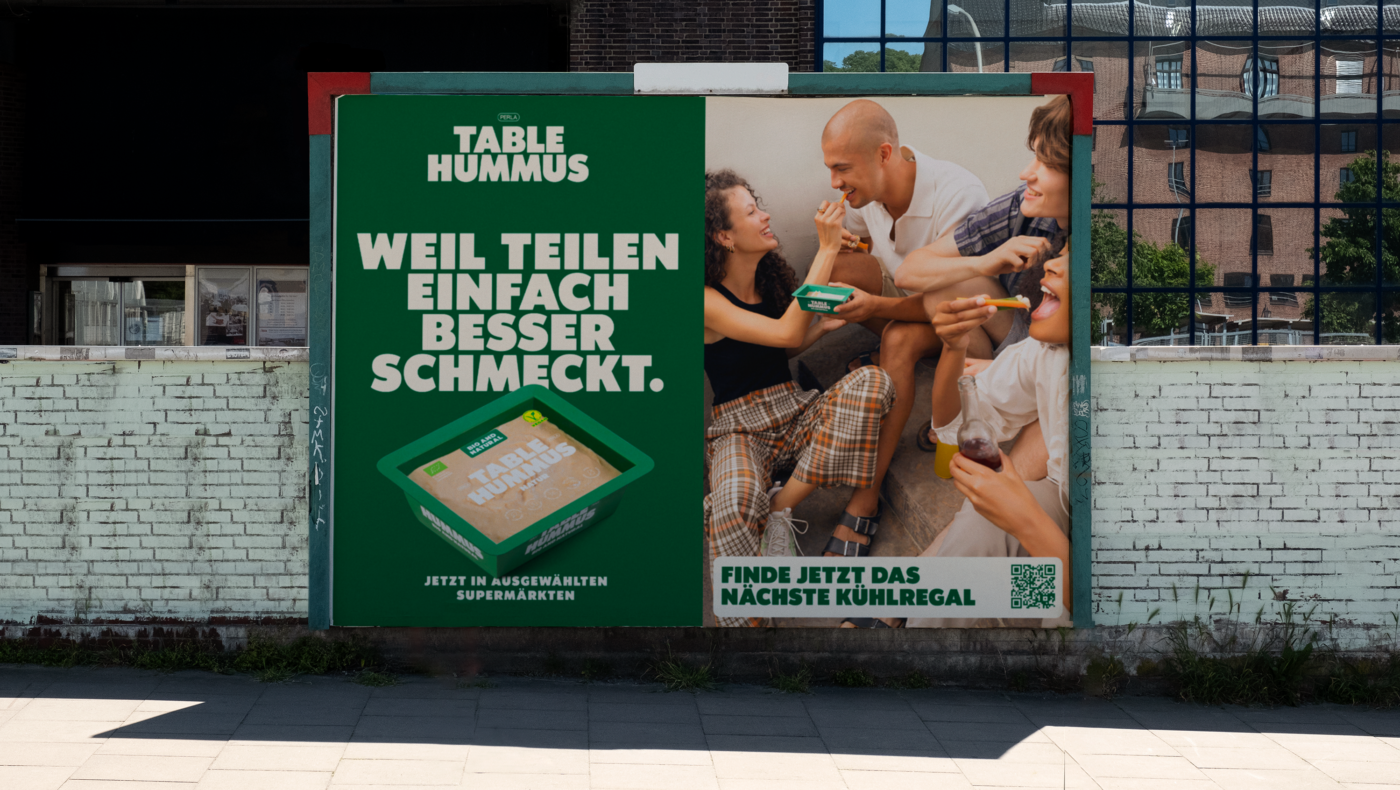
When Table Foods entered the market, we focused on brand recognition – striking billboards in brand colors and the recognizable custom Table Black font were key elements. We combined warm and soft appealing images with tongue-in-cheek claims displaying everyday scenes of people sharing ready-to-eat hummus and antipasti. Tailored to the younger target group for Table Hummus, we focussed on emotion and more dynamic angles, while Table Antipasti showed bigger mixed-aged groups and used calmer compositions.