DMEXCO
Complete Rebranding for Germany's Largest Digital Marketing Expo and Conference

Services Provided
- Branding
- Web Design
- Spatial Design
- Development
- Copywriting
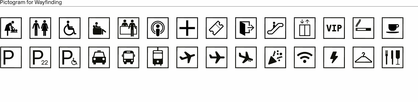
- Way-Finding System
- Photo Production
Specs
Services Provided
- Branding
- Web Design
- Spatial Design
- Development
- Copywriting
- Way-Finding System
- Photo Production
Specs
1
Objective
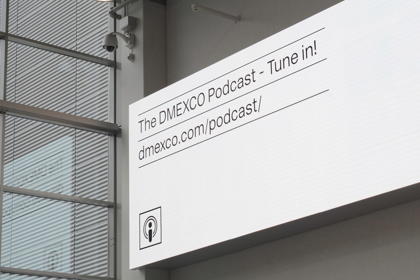
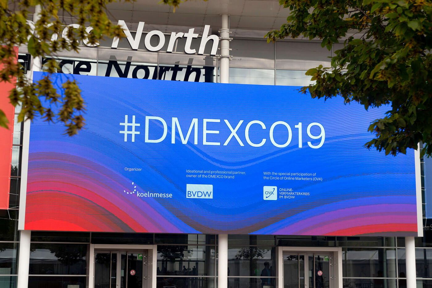
DMEXCO is one of Europes largest and most prominent digital marketing events. 1000+ companies and more than 40,000 visitors come together every year, each one with their own identity. We were commissioned to develop a visual language that stands out and doesn't get lost in a busy environment, and to create a sustainable framework for the event and the year-round ecosystem. The visual communication had to be clear, transparent, modern and timeless, in order to stay relevant for many years to come.
2
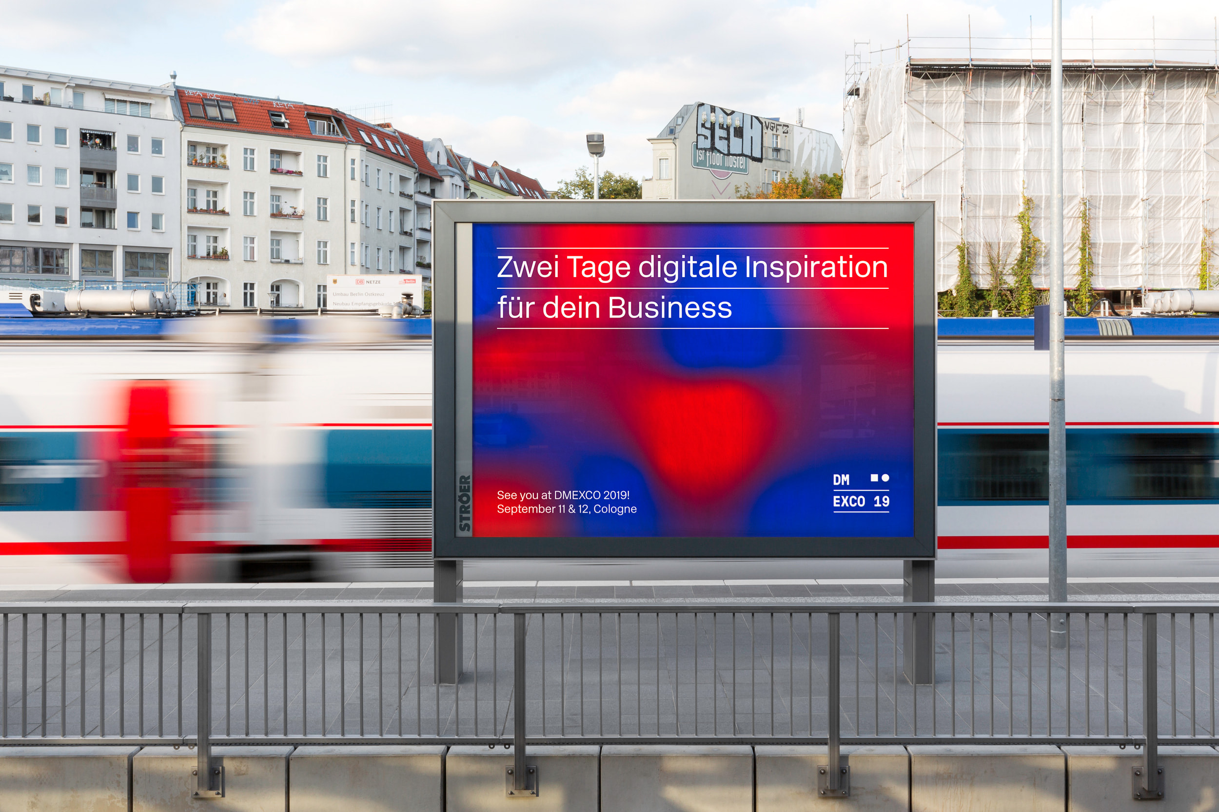
Approach
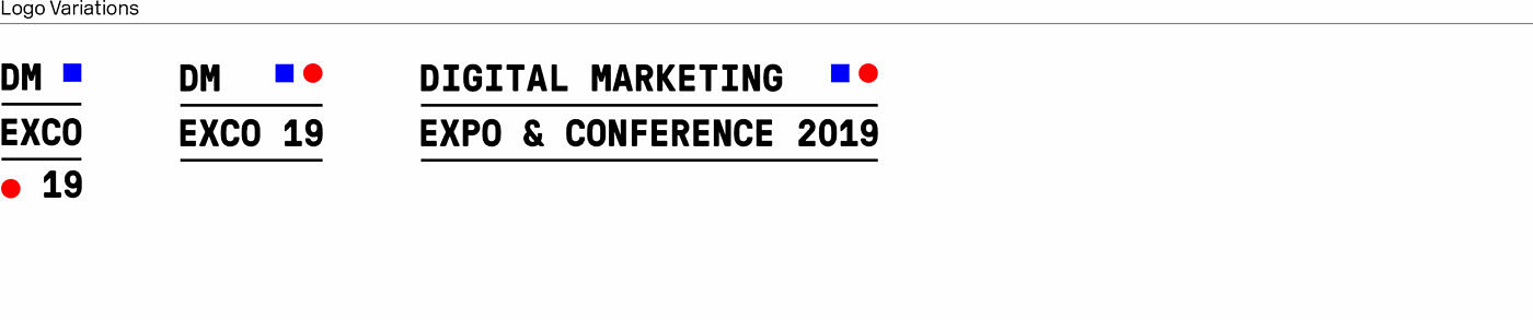
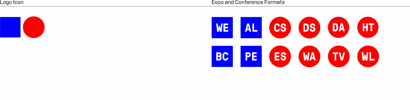
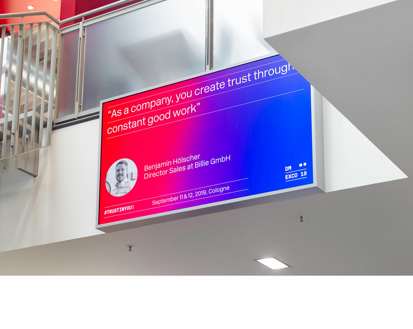
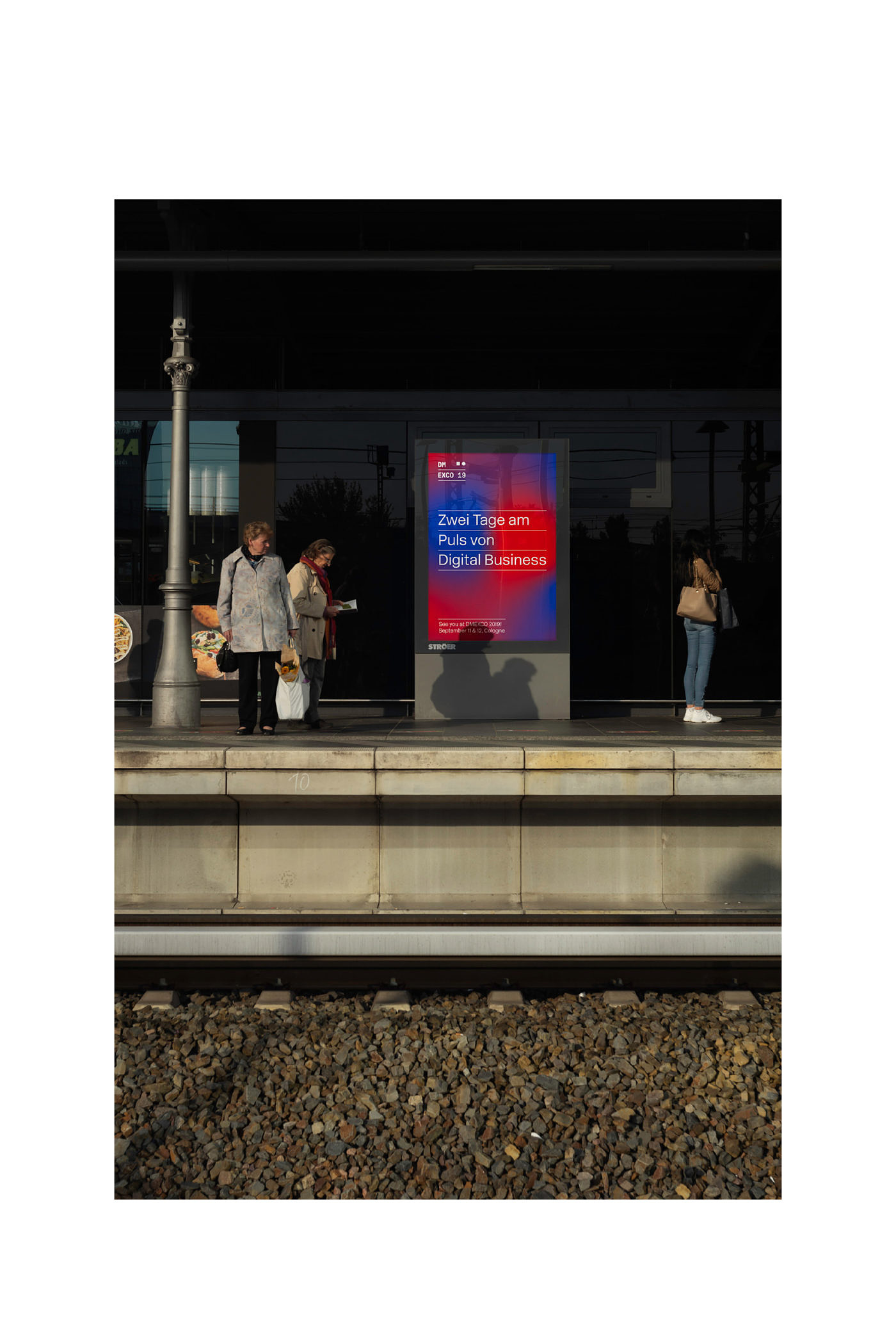
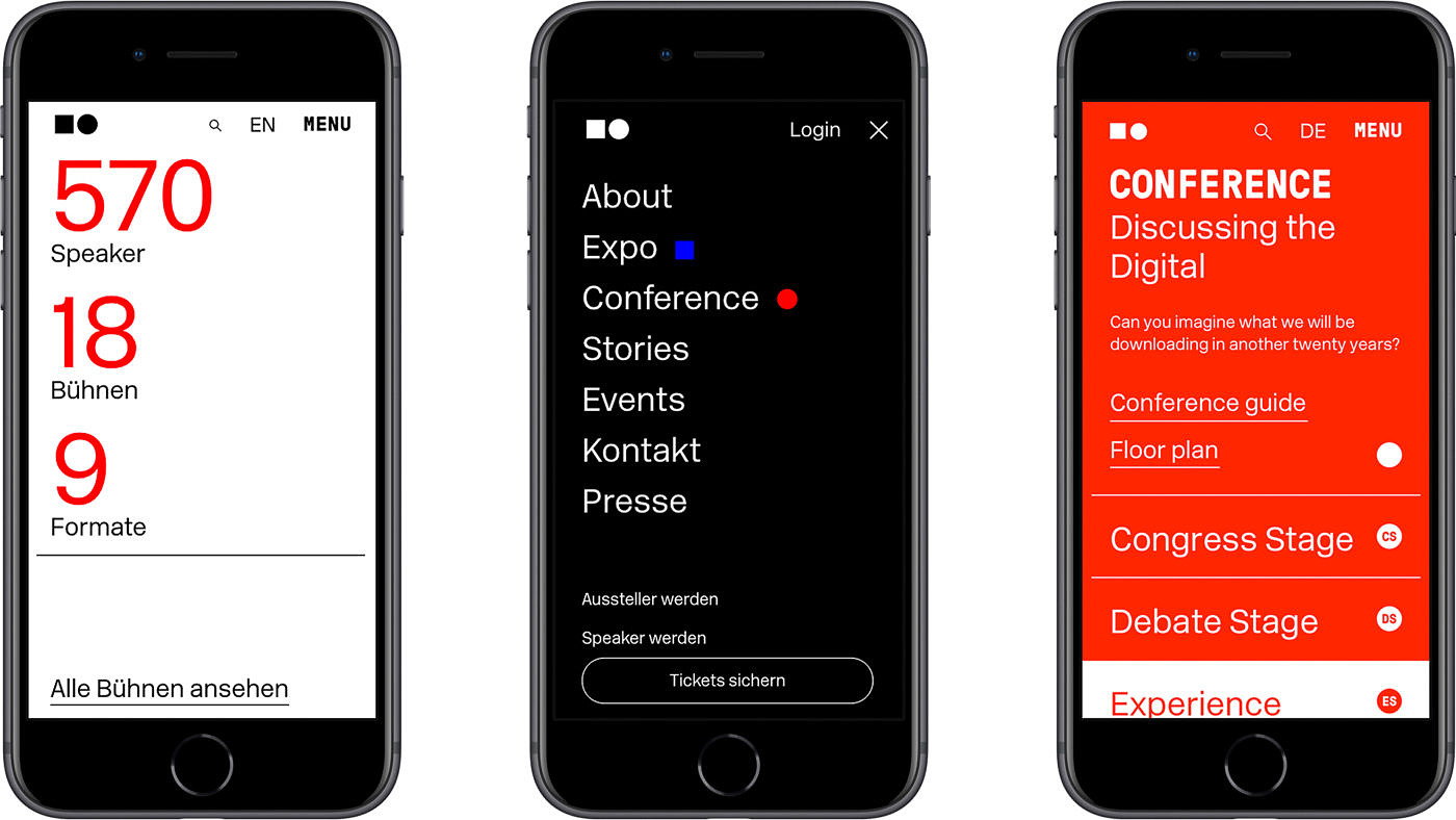
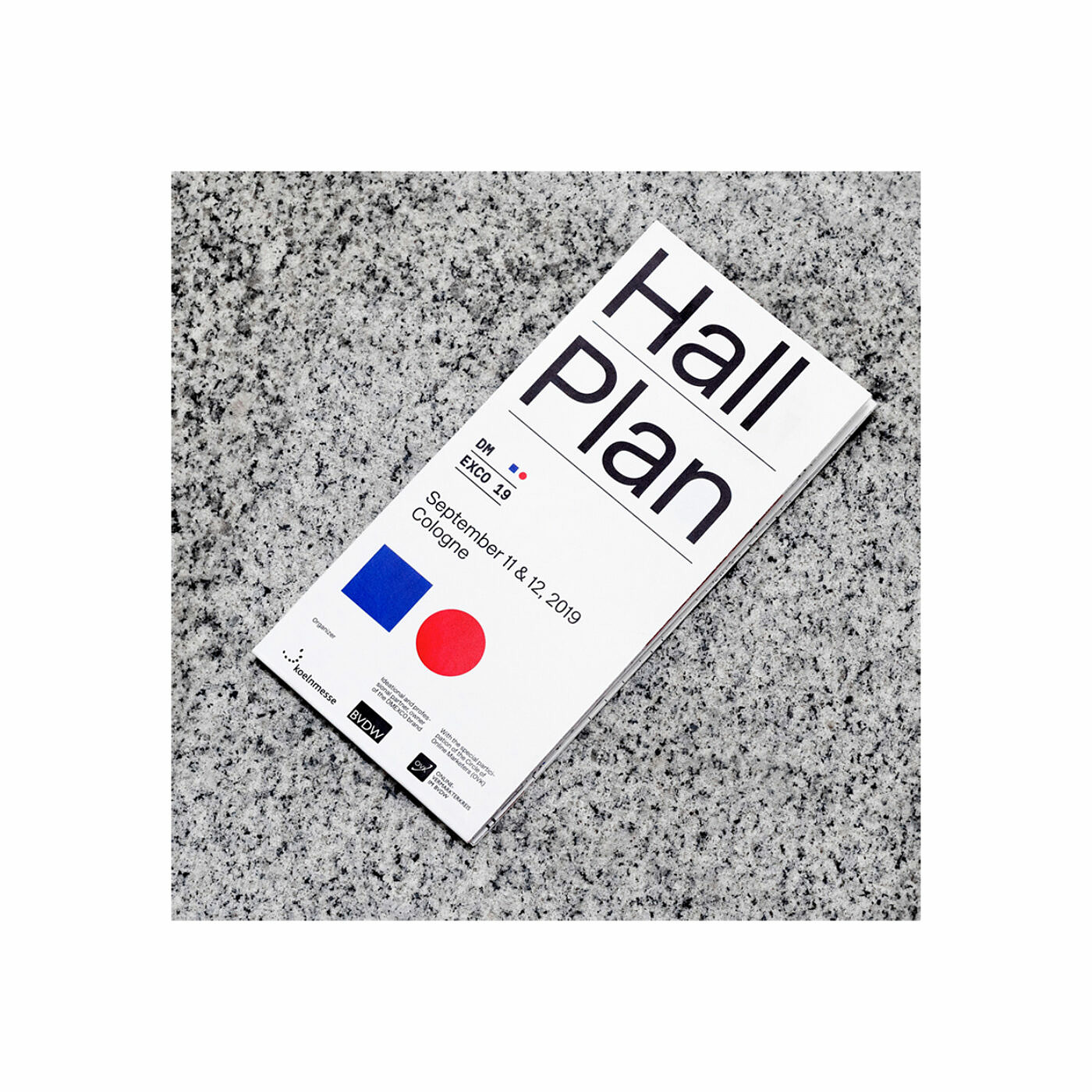
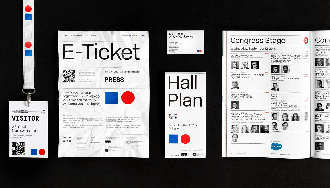
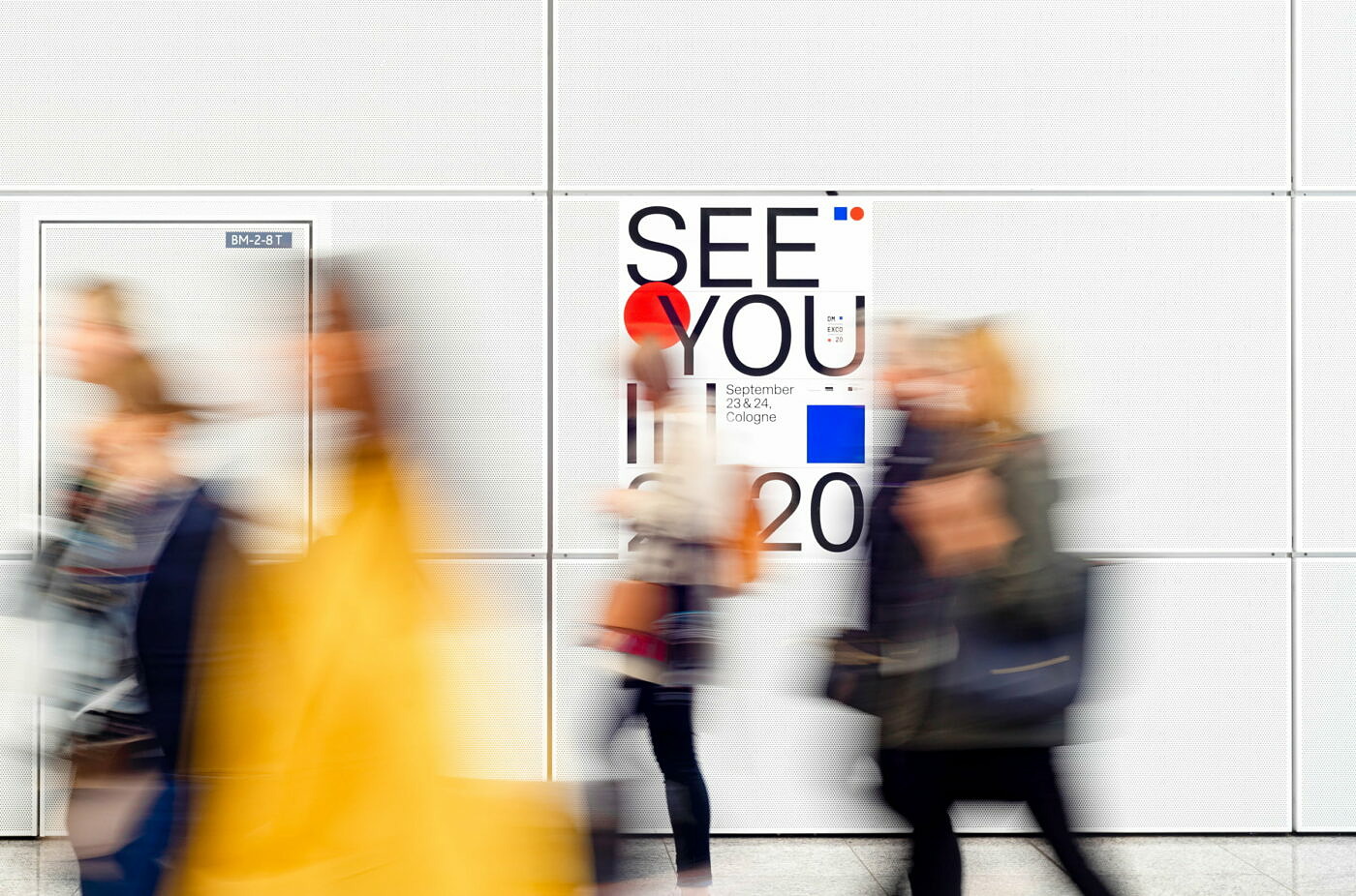
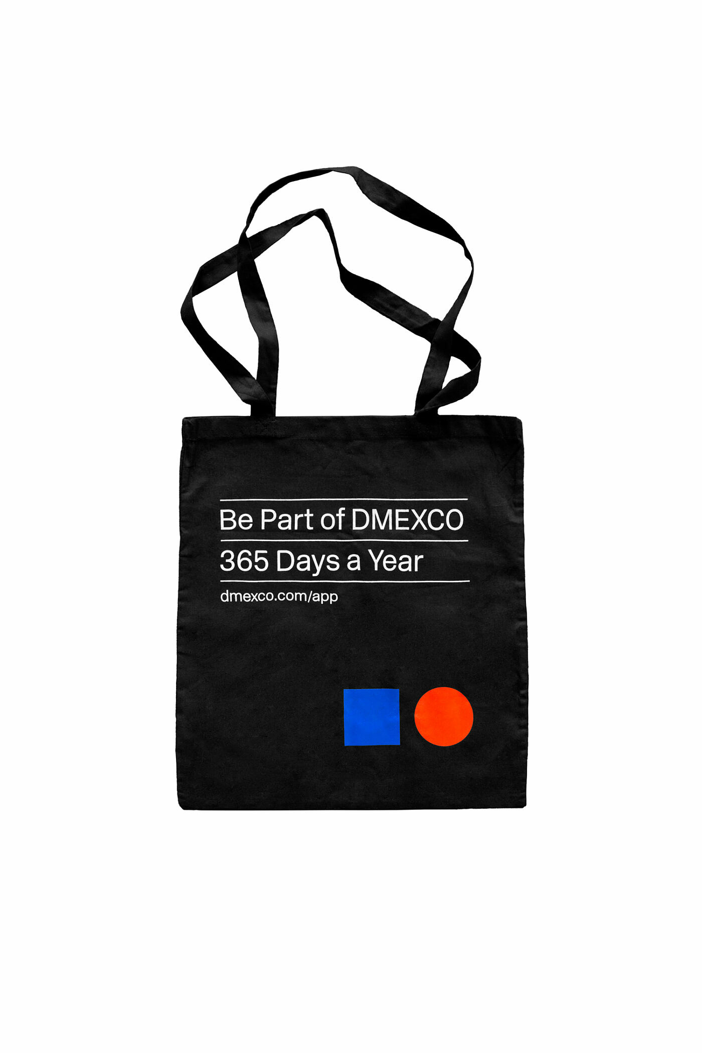
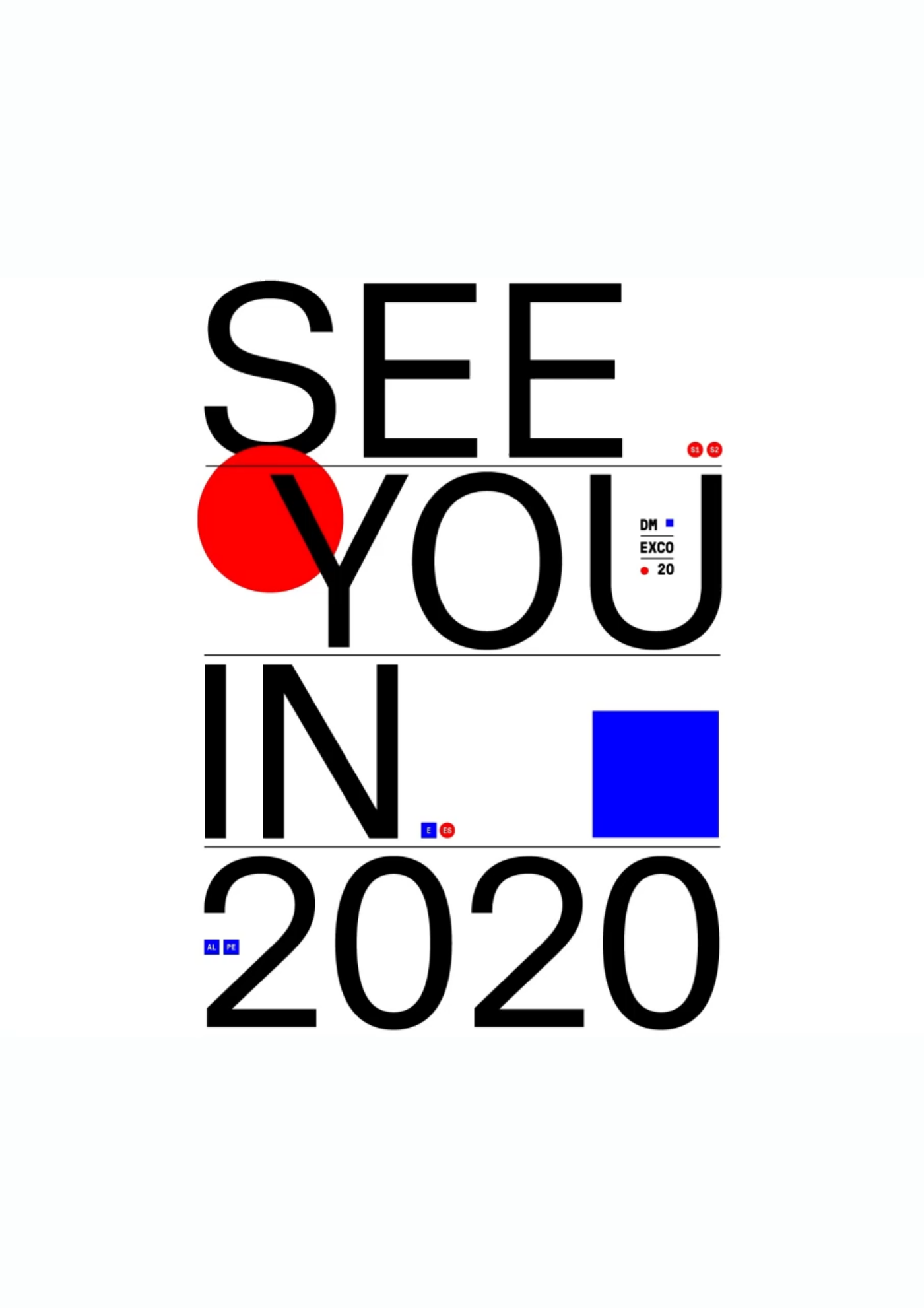
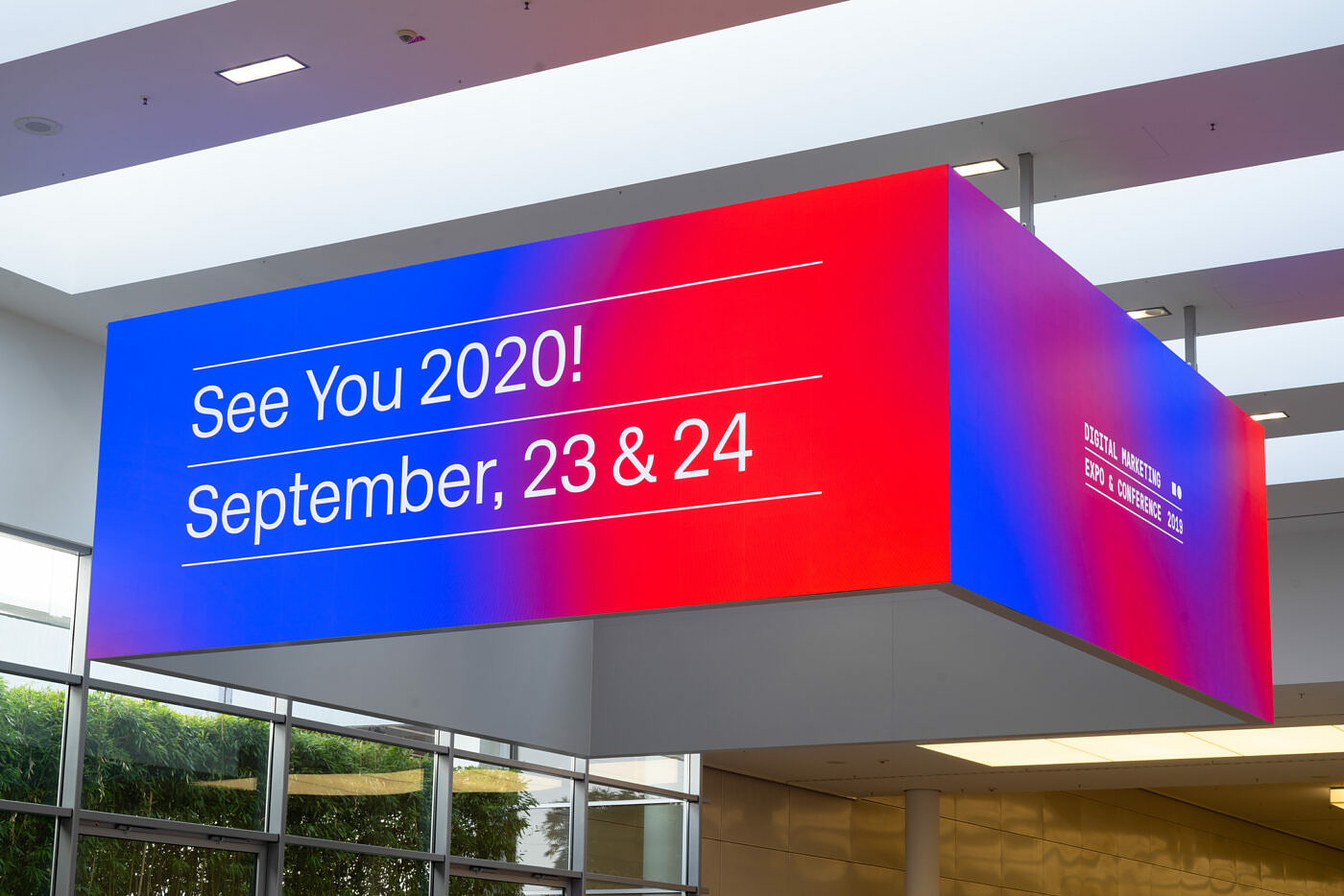
The logo is a dynamic system representing the concept of responsiveness which is the very basis of digital design. Starting with the longer version, representing large mediums such as billboards, desktops, and big screens, and going all the way to the icon version, representing small mobile devices and vertical billboards. The central element of the new CI and logo is a dual color and shape code that reflects both the online and offline aspects of DMEXCO as well as emphasizing and connecting the Expo and Conference areas: the color blue and the square will symbolize the Expo in the future, while red and the circle will represent the Conference. The result is a web-enabled and clear CI that works equally well on all platforms.
3
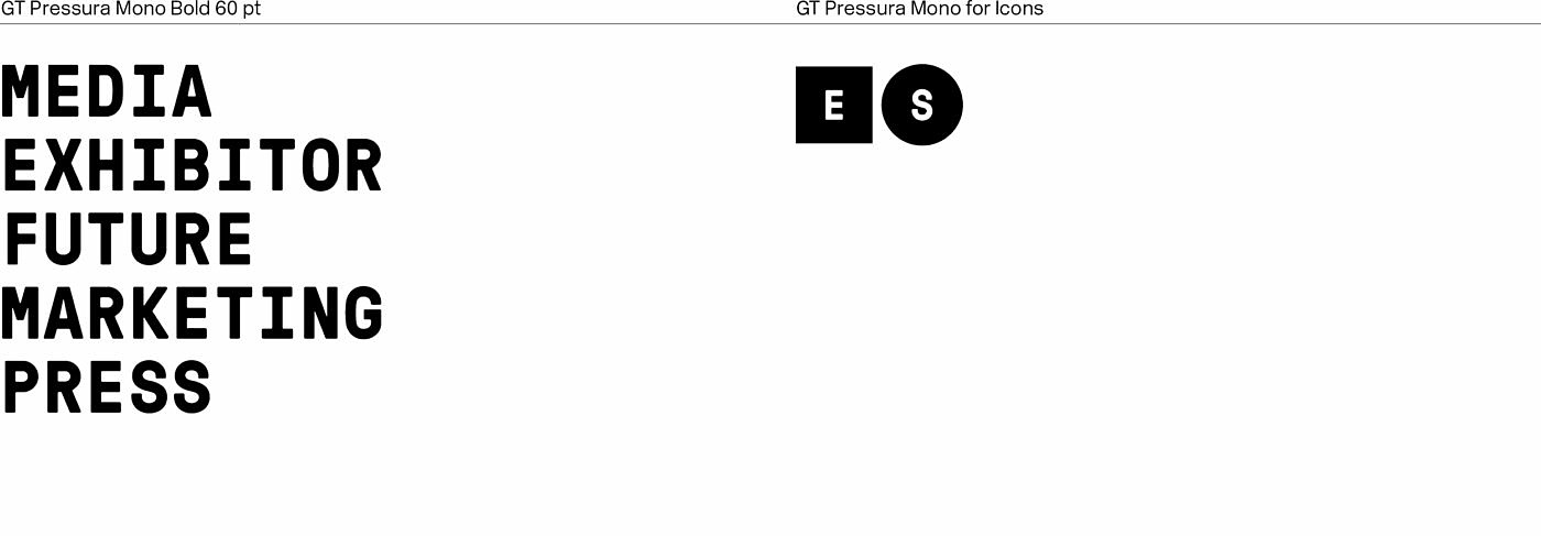
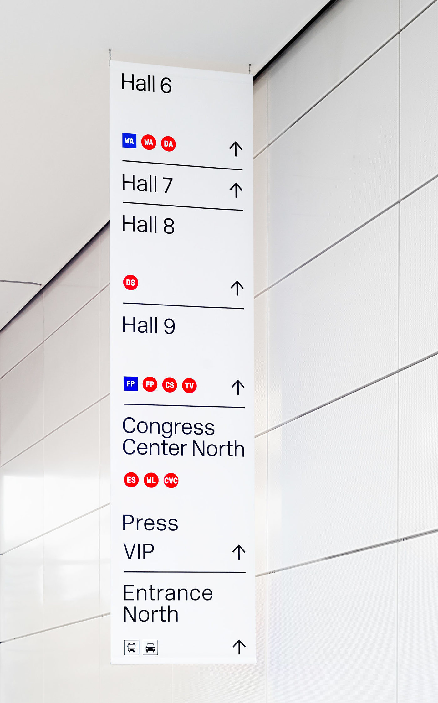
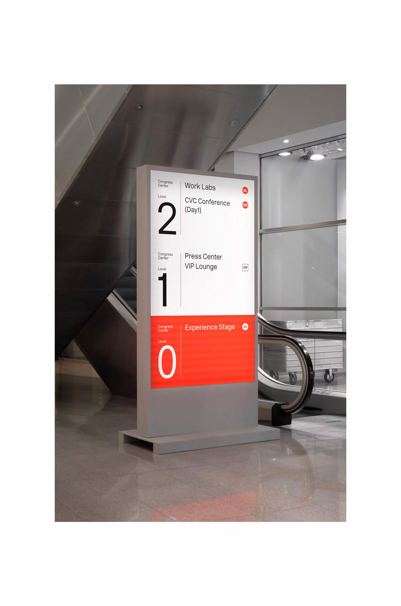
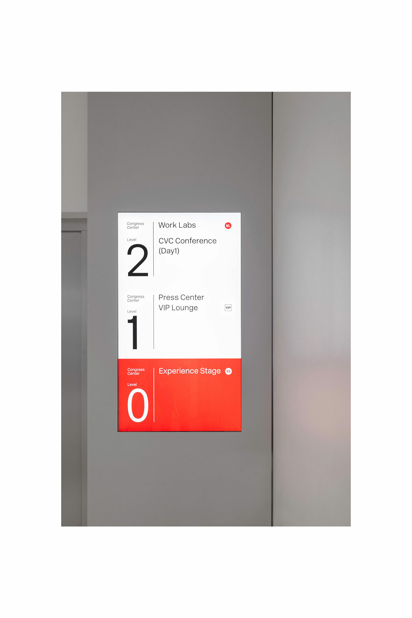
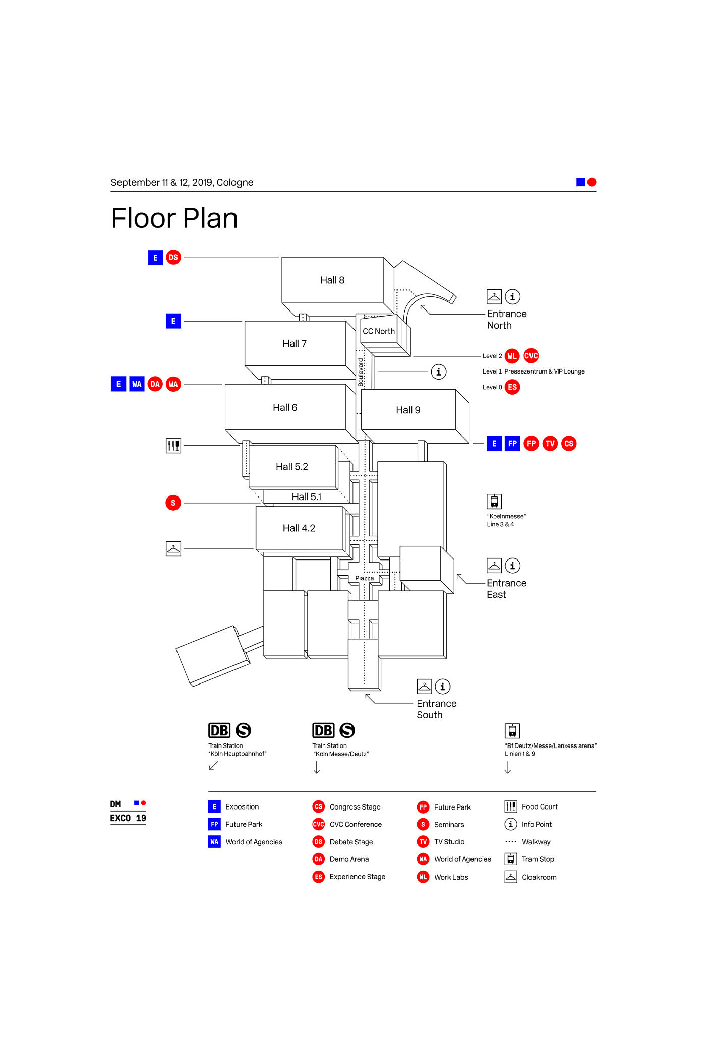
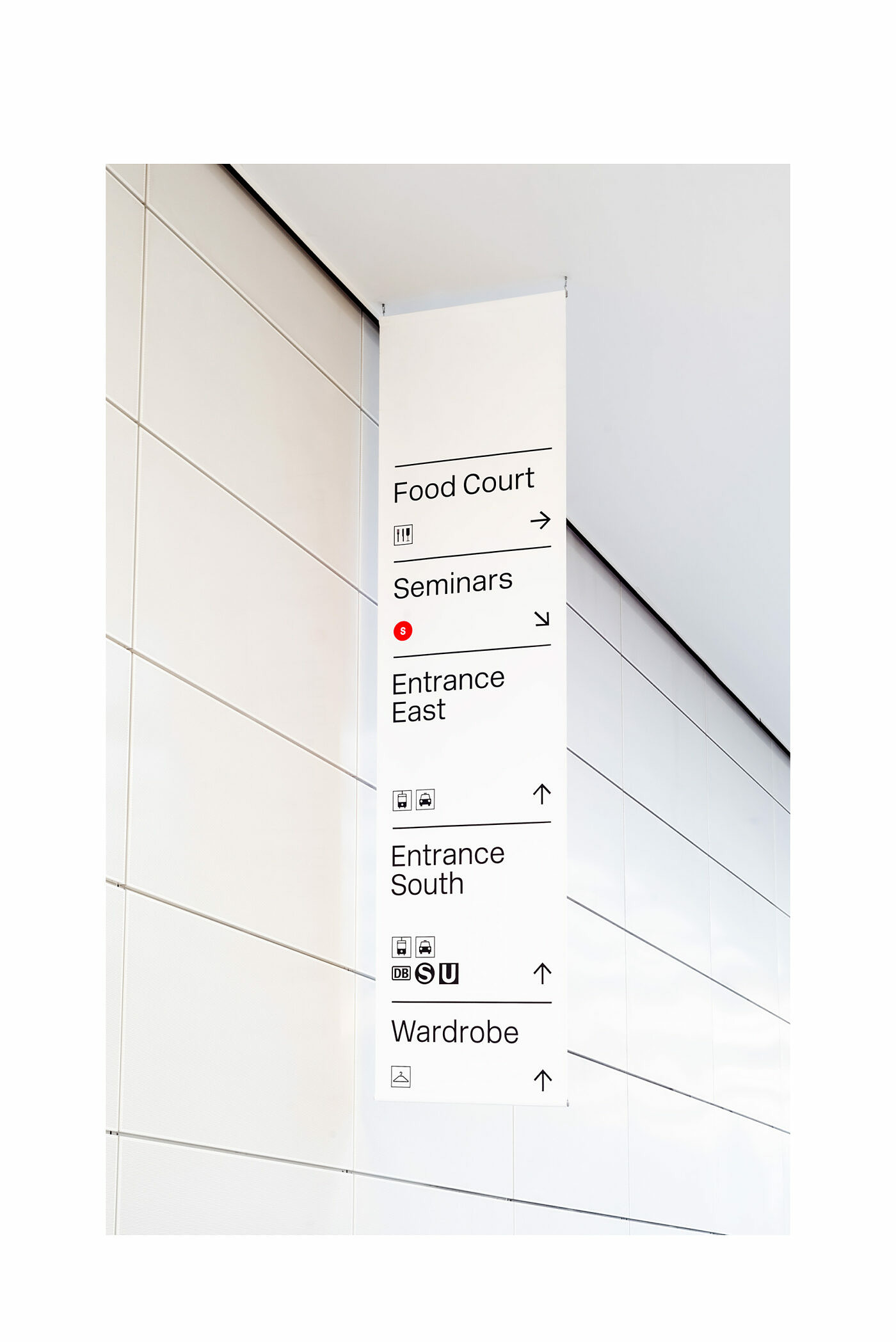
Solution
Our system assigned blue and red with explicit meaning. Blue represents expo and red represents the conference. We made sure this was consistent across all assets, both offline and online. This created a visual language that people can rely on. We also assigned a shape to each part. Square is expo, circle is conference. This provided two levels of visual identification that are basic and understandable, yet distinct and recognizable. Based on this we also created an icon system that assigned a logical abbreviation to all stages and halls, allowing people to navigate the event with ease.