La Triennale di Milano
New Brand for La Triennale di Milano
Services Provided
- Competition
- Branding
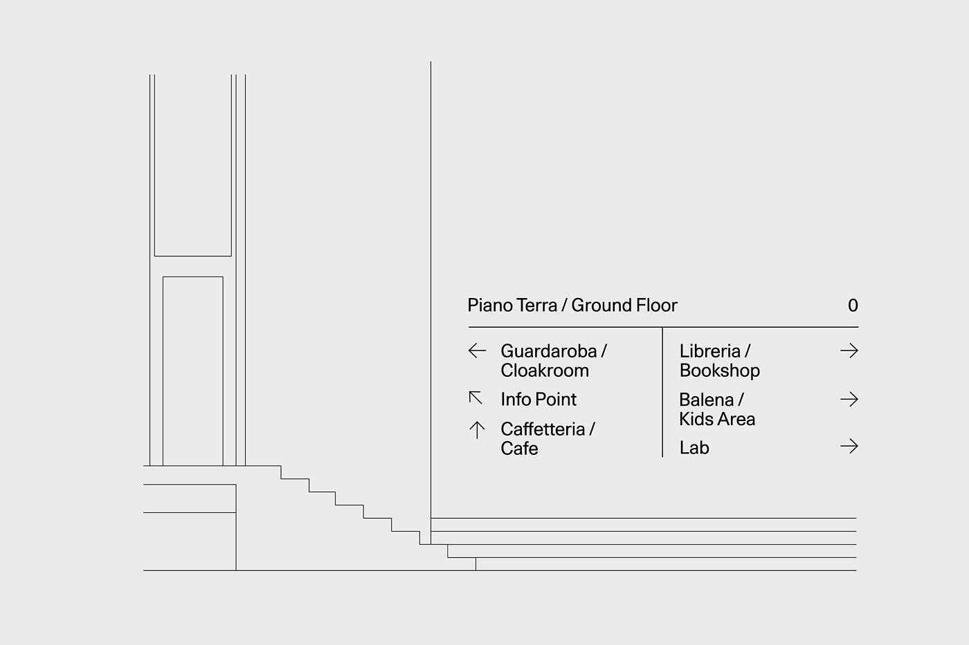
- Way-Finding System
- Editorial Design
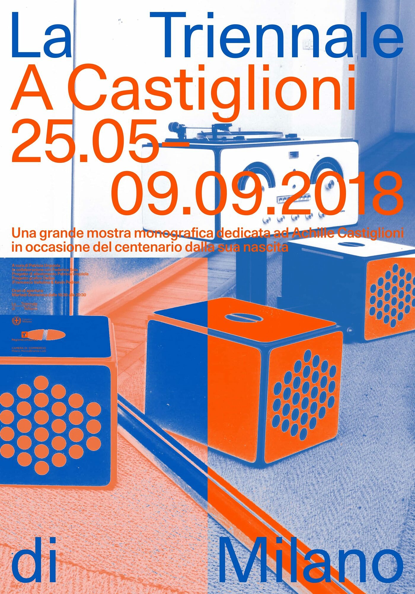
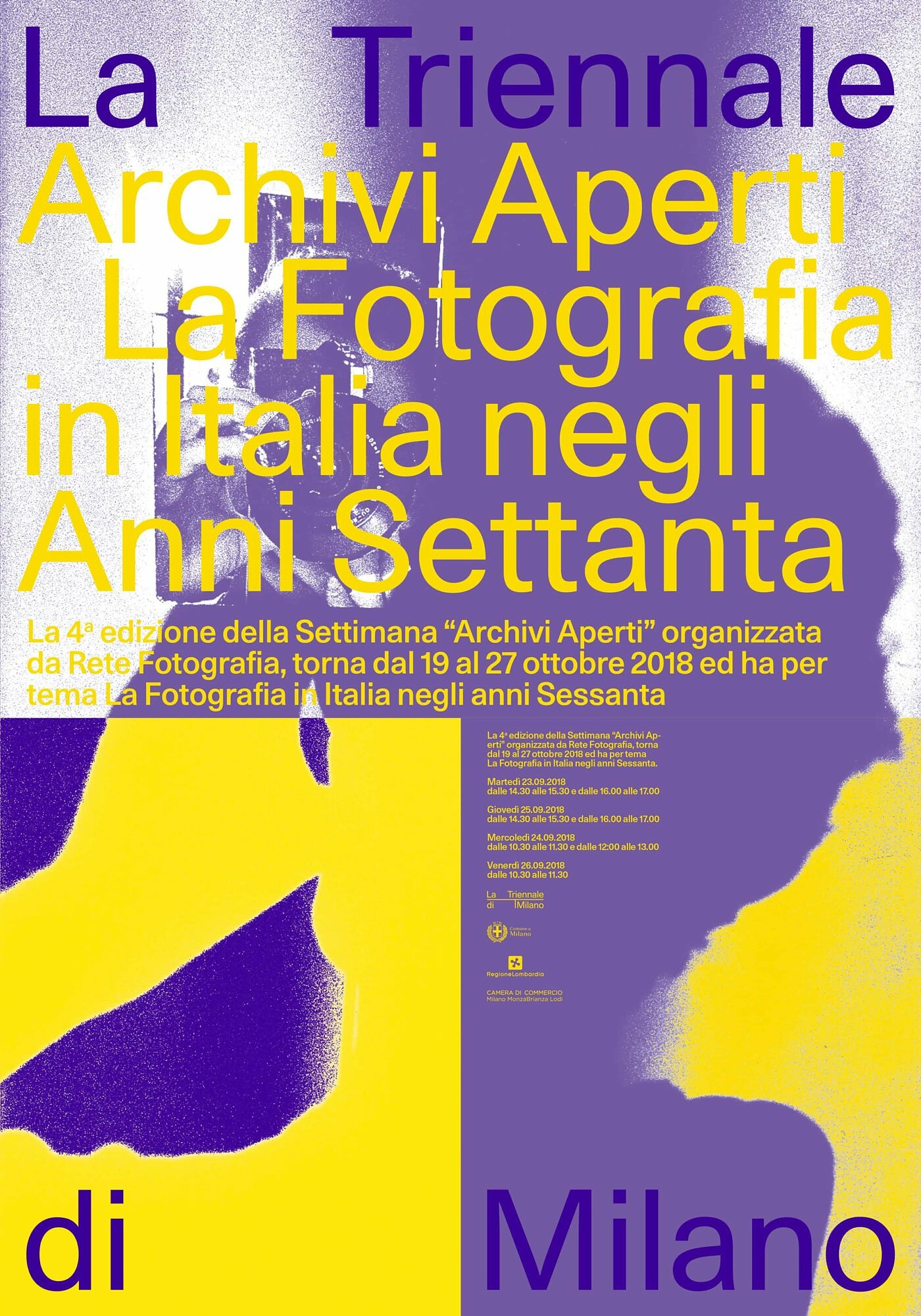
- Poster Design
Specs
Services Provided
- Competition
- Branding
- Way-Finding System
- Editorial Design
- Poster Design
Specs
1
Objective
In Fall 2018, La Triennale di Milano, a cultural institution dedicated to architecture and design, announced a public tender for a new visual identity. In line with La Triennale’s renewed mission, the identity should strengthen the institution's place in contemporary society and communicate a more cohesive voice across its initiatives including a new permanent collection of industrial designs, exhibition spaces, and a theater.
2
Approach
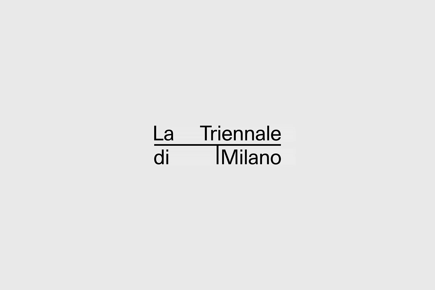
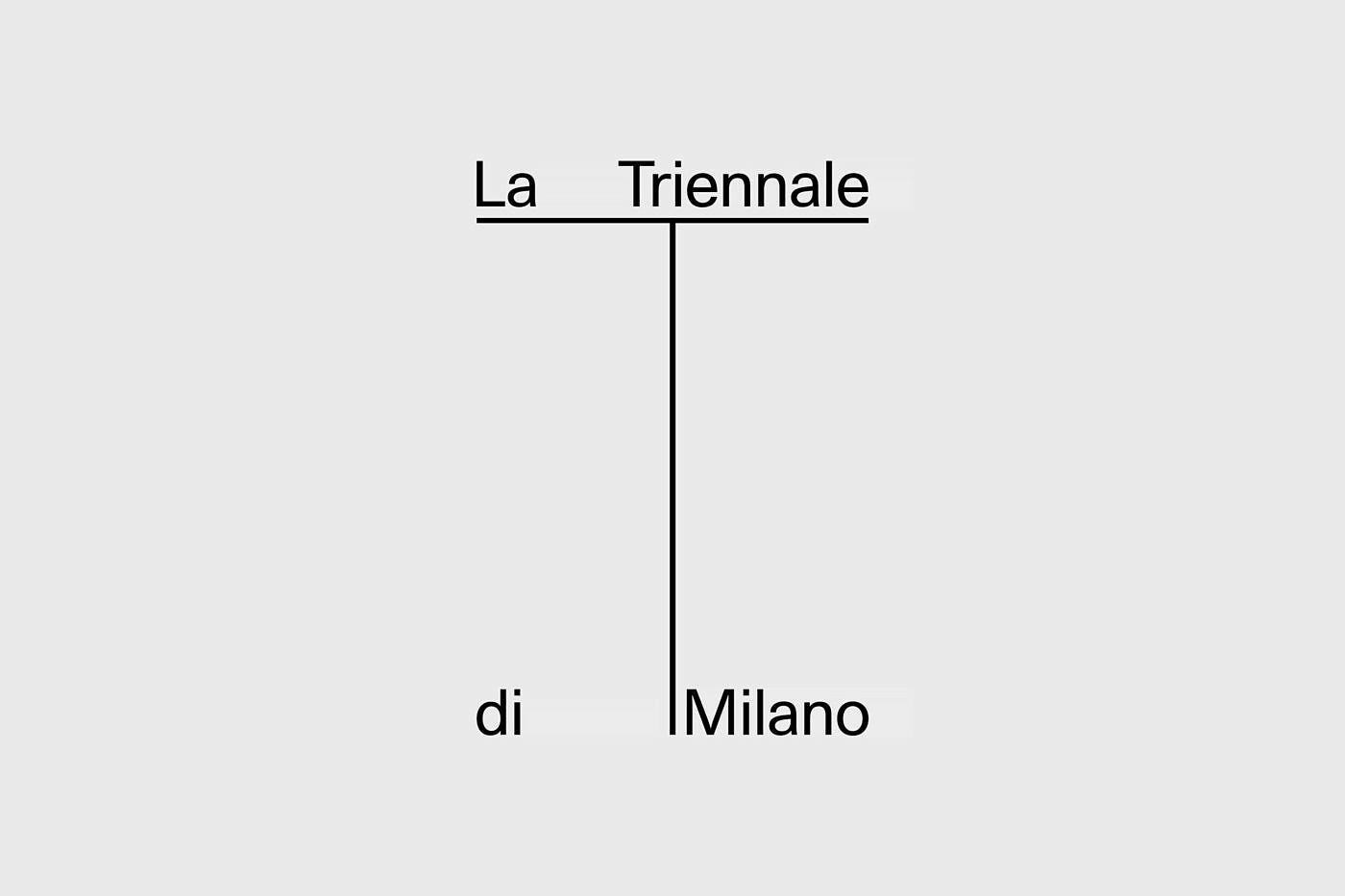
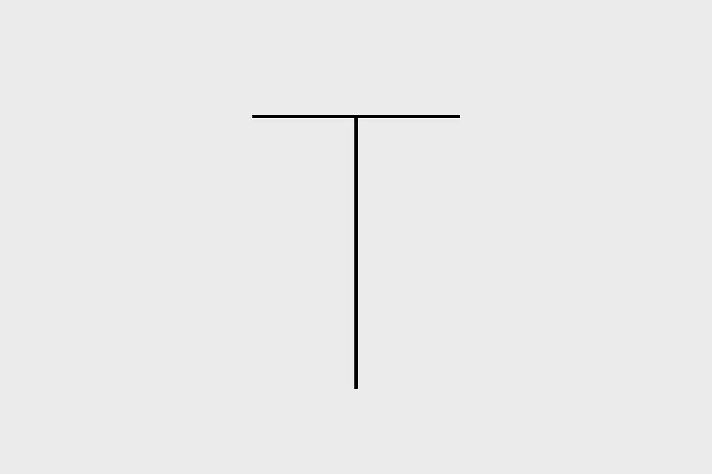
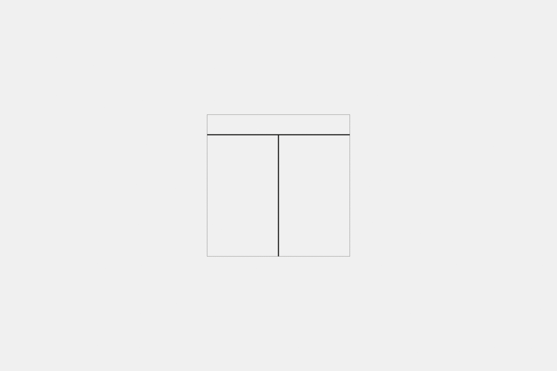
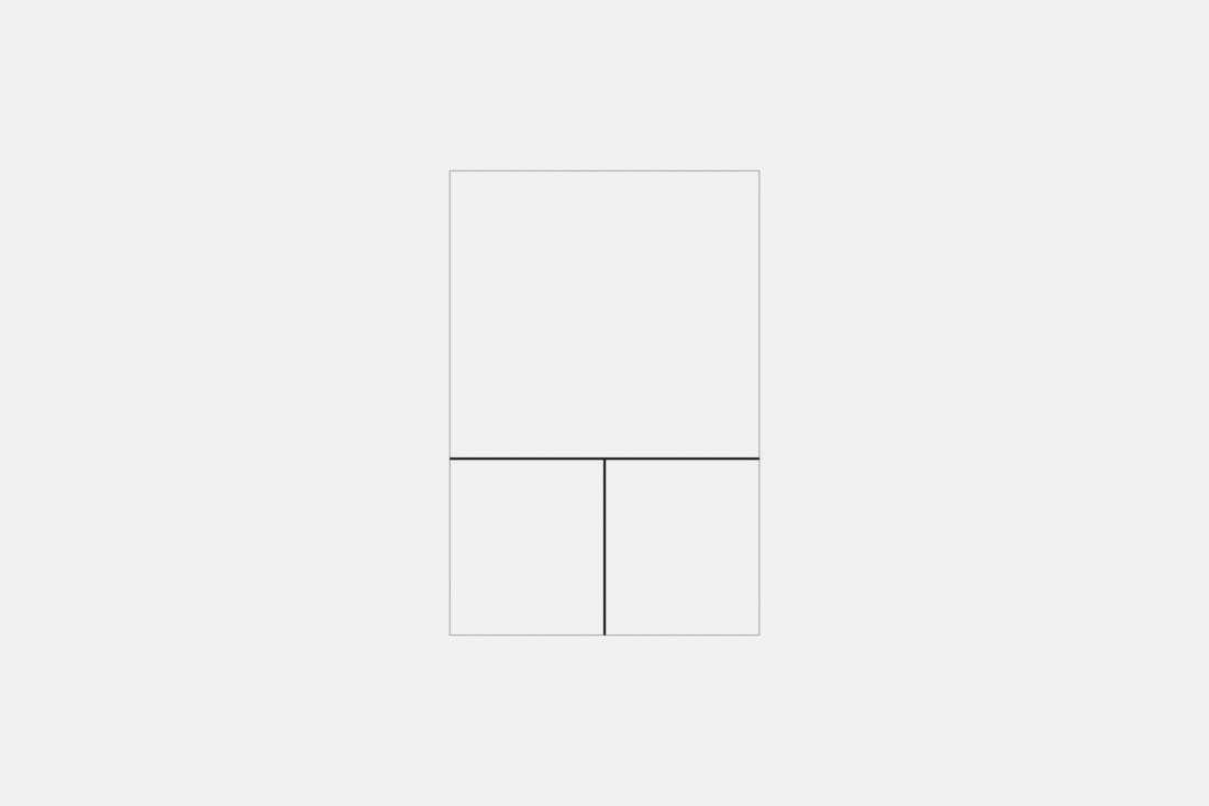
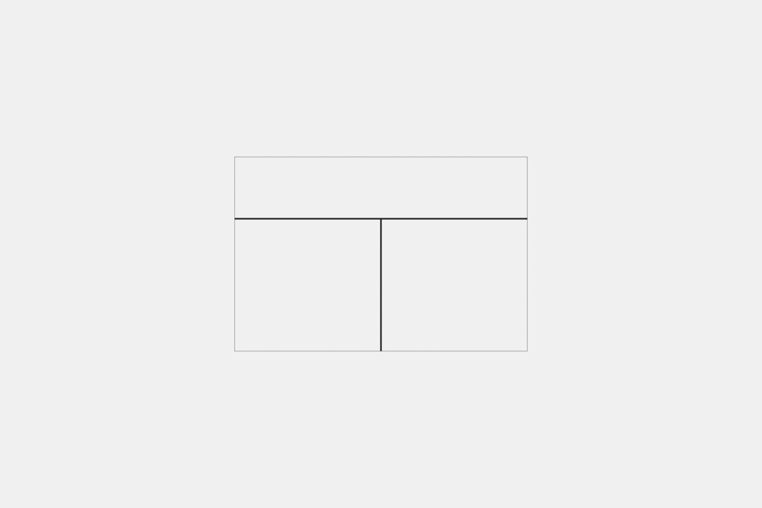
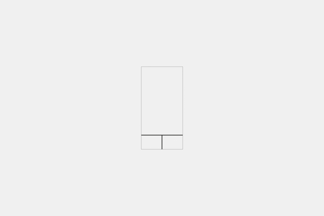
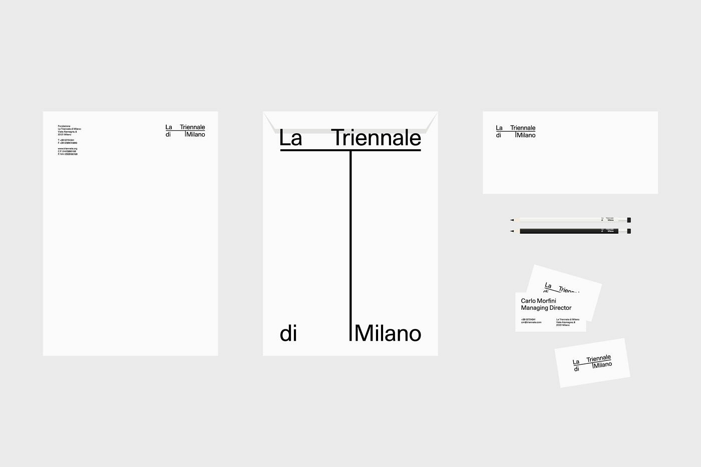
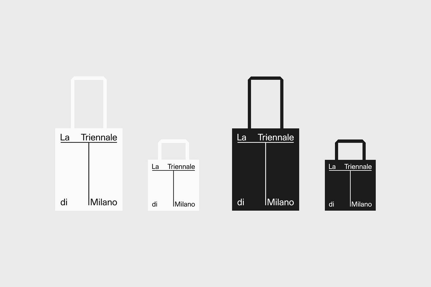
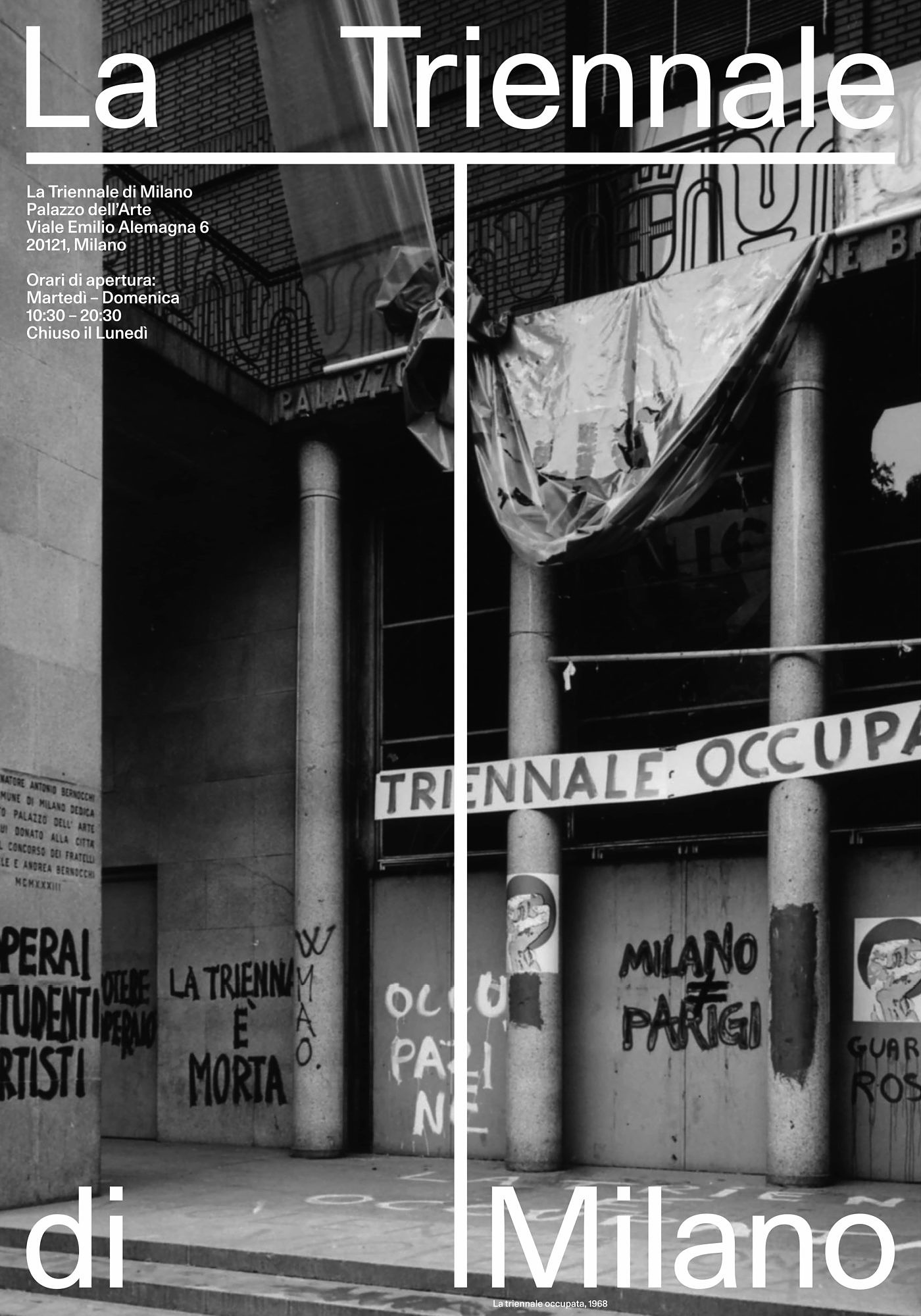
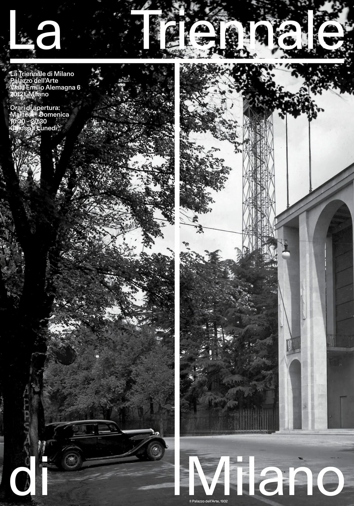
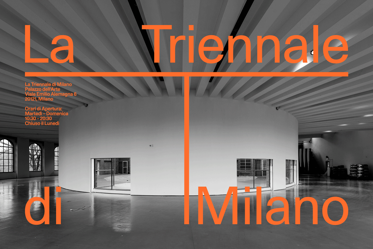
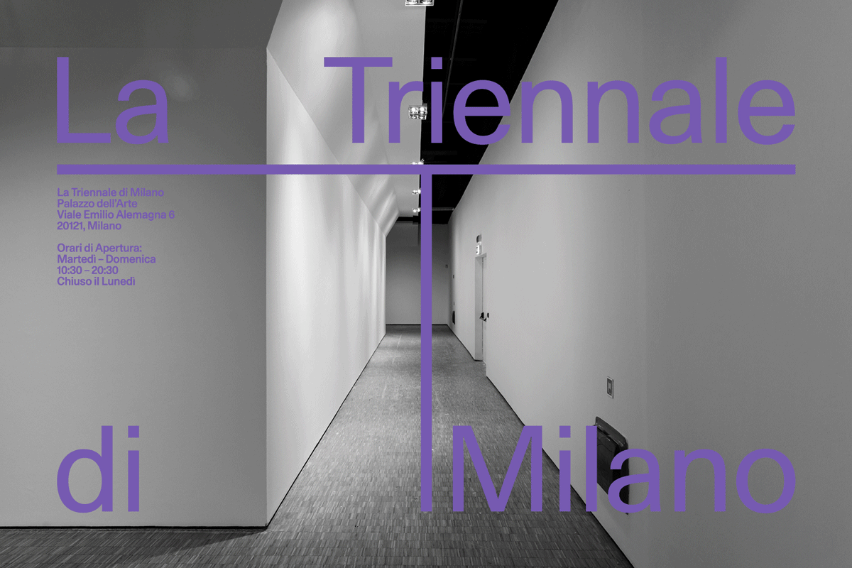
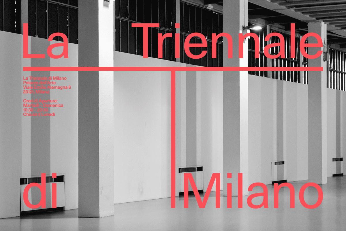
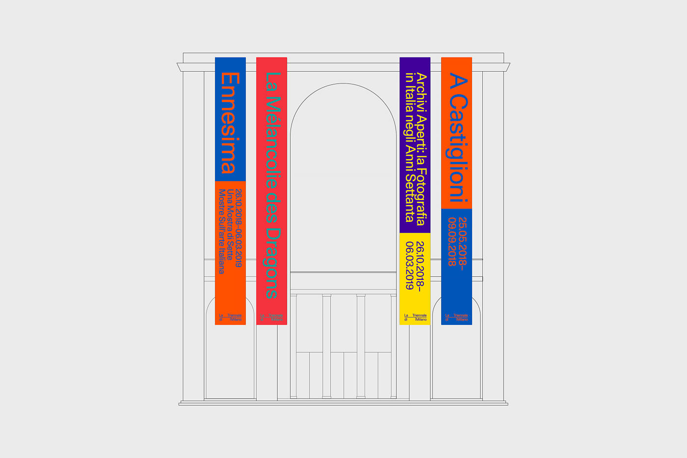
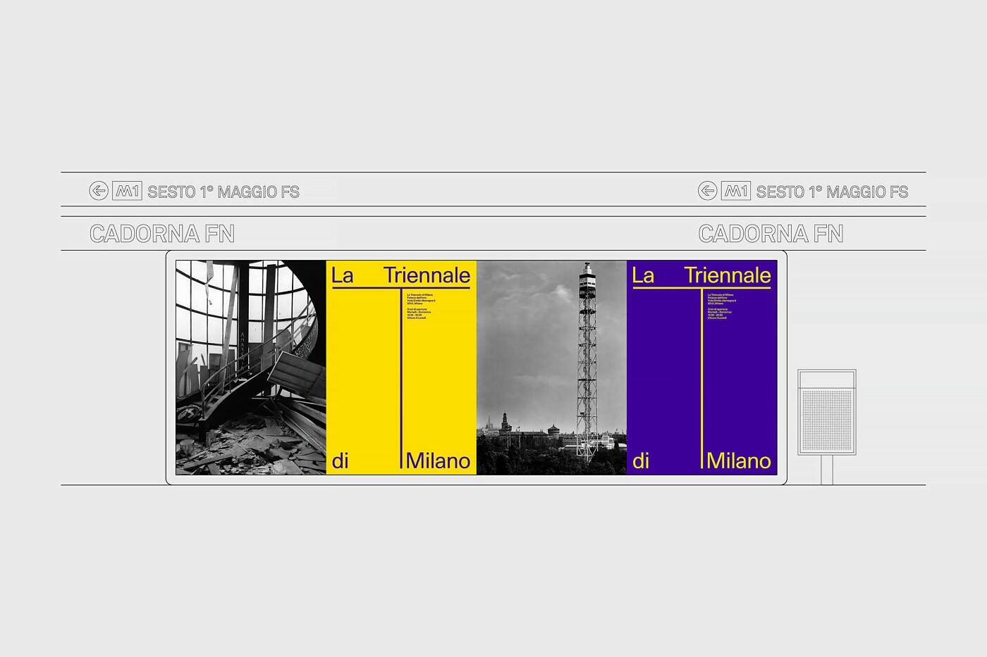
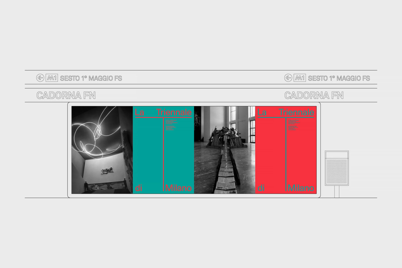
The Triennale ‘T’ has become an architectural symbol for the institution and a landmark for the brand since the 20th century. In our proposal, we attempted to modernize the logo by removing the decorative features that surrounded the ‘T’ and turned it into a grid which could be used in print, web and environmental applications.
3
Solution
To organize images and type more consistently we developed a dynamic grid out of the two column structure and perpendicular line of the ‘T’. We juxtaposed the logotype with a brighter color palette for a series of posters and banners. The proposed visual language is more recognizable across La Triennale’s initiatives and modernizes the institution's image as it moves in a new direction.